Adding an introduction to a form
Regardless of whether a form is single- or multi-step, it should have an introduction. The exception is if the introduction — with content as outlined below — would be almost as long or longer than the form itself. In such cases, an introduction is optional.
The introduction should be located before the first data entry. For most forms, the introduction will need to be a standalone screen but for very simple forms or forms with very brief introductions, the introduction and data entry can be on the same screen.
If the introduction is on its own screen:
- it is this screen that should be indexed and shown in search results, never the first screen of data entry
- unless it includes eligibility, the introduction screen will be part of the informational site, rather than part of the transactional environment
What a form's introduction must include
About this form
Ideally one, but no more than two, lines explaining what the form is for and who should complete it.
What you will need
- a bullet point list of any external sources (people or documents) the form-filler will need in order to complete the form, especially ID or reference numbers. Briefly explain where ID or reference numbers can be located on artefacts that are likely to be at hand (for example, drivers licence)
- if the form-filler will need a printer, a credit card, or some other equipment to complete the form, and what to do if they don't have this
How long it will take
An estimate of how long completing the form will take, to the nearest 5 minutes and accurate for roughly 80% of cases. As soon as possible, adjust the initial estimate to reflect from actual metrics.
Saving a partially completed form
If save and resume functionality is provided, one line explaining that the form can be saved and finished within <x> days from starting.
Privacy
You may need to provide a collection notice if your form is collecting personal information. Refer to protect privacy - digital guide for more information.
This introductory text should be followed by a highly prominent button for starting the form (see also Submit and start buttons on Layout of forms-key components). If appropriate, the button can be repeated (for example, at the top and the bottom of the page). In multi-step forms, the introduction is not part of the slick pipeline, nor should it be included in any progress indicator.
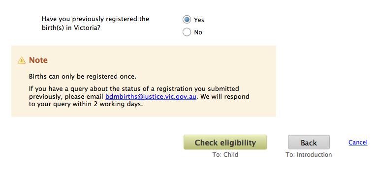
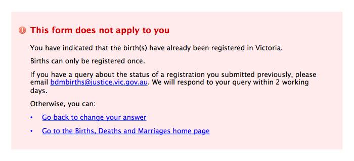
Eligibility
Declaration
'Declaration' includes:
- confirmation of acceptance of terms and conditions (if needed)
- agreeing to ways the information in the form may be used statutory declarations (which is essentially a simple declaration with more form fields)
If the form contains a declaration, it should be:
- labelled 'Declaration' or 'Statutory declaration'
- set in the default font size, weight and colour, and flush left
- follow the relevant guidelines for presentation and behaviour of form fields (although if the declaration text is more than two sentences, it can be set full width of the form body)
- made easier for scanning through the use of bullet points, short paragraphs and/or sub-headings
The agree/disagree question that appears after the declaration text should be prominent, and visually separated from the text. Ideally the question will have a 'yes/no' radio button answer option
(for example, 'yes/no' or 'agree/disagree'), rather than a single checkbox, to make it absolutely clear what answer the form-filler is giving.
If the declaration text is long, the declaration should be a separate step in the process. Otherwise, include it as the last component on the last data entry screen.
Review
Whenever a form has more than one screen of data entry, it should have a review step.
The review screen should:
- contain every question that was shown to the form-filler (that is, include optional questions but not conditional questions that were hidden)
- present the question and the form-filler’s answer in the same order as they appeared in the form, with the same section and/or step heading'
- have a button labelled 'Edit <H>' located after the last row of information in a given section or step, vertically aligned with the heading for that section/step, where <H> is the section or step heading
- have sufficient white space between sections and steps, to help visually associate edit buttons with the right section/step
- present the questions in the default font size, weight, colour and alignment
- present the answers in the same font size and colour as questions, but in bold and with the same alignment as fields in the form
- for any optional questions that weren’t answered, leave blank the place where the answer would be shown
- if data has been manipulated after entry by the form-filler — for example, translation into UPPER CASE — and this manipulation has been done because of system or business constraints, present the data in the manipulated format, and include a note along the lines of 'Our systems require this information in a certain format, so your answer has been automatically changed to <x>.' <x> describes the manipulation on the data, for example, 'upper case'. The note should be displayed in the equivalent location to Question-level help. No message is needed for manipulation into a consistent, more readable format that doesn’t change the substance of the answer (for example, chunking phone numbers)
Changing answers from Review
Once they reach the Review screen, the form-filler should have two methods of changing an answer:
Method one for changing answers
Method: Use the 'Edit' button for the relevant section or step
Action: The chosen step is loaded, anchored to the relevant section (if applicable)
Method two for changing answers
Method: Use the 'Back' button at the bottom of the screen
Action: Load the immediately preceding step.
Both methods should retain all the data provided by the form-filler.
If there are no cross-step dependencies in the form — that is, changing the answer to a question in one step has no impact on other steps — then change the navigation options at the bottom of the step being edited.
The progress indicator must not be used for navigation, including allowing edits from review.
From:

To:

As the labels and help text for these buttons suggests, the buttons take the form-filler straight back to the Review step, once they have made their changes to the current screen. This results in a streamlined experience, and is possible because there are no cross-step dependencies.
There is no 'cancel' link because of the confusion this may cause when present with a 'Discard changes' button.
In all other cases, the navigation on the screen remains the same and the form-filler must then use the 'Next' button to move forward through the form, one step at a time. This allows the form to adjust to the new answer(s), and the form-filler has the opportunity to review later answers in light of this change.
Completion
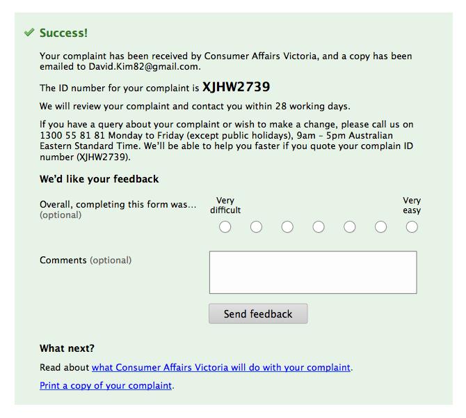
As with the introduction, every form should have a completion screen, no matter how many steps the form has. The completion screen appears after the form has been submitted and must:
- convey that the submission has been successful
- indicate whether a confirmation, summary or full copy of the submission has been emailed, and to which address
- explain what will happen next
- provide contact details for any enquiries about the submission
- very prominently display the reference number (if any) for the submission, and explain that this number should be quoted when enquiring
For multi-step forms, if a full copy of the submission has not been emailed, the completion should also provide the functionality to print a copy of the form fields and the responses given. This printed copy should be formatted to support reading and scanning, and styled to suit a black and white, A4 page.
Form feedback
Ideally, feedback should be gathered from form-fillers at the end of each online form, especially multi-step forms. The feedback is gathered after the form has been submitted, so as not to impact on completion of the form.
A highly reliable and valid measure is the Single Ease Question (SEQ):

Note this is the only time radio button response options are presented horizontally. The exception is made because this is the layout validated by statisticians (for more information, visit 10 things to know about the Single Ease Question - MeasuringU website).
After the rating question, present an open text field for the form-filler to provide comments:

Both questions are optional.
For submitting the feedback, a button with secondary styling should be used (to convey the lower importance relative to the form itself):

The rating and comments provide a measure of Satisfaction. As per the relevant international standard, the other two components of usability — and appropriate measures — are:
- efficiency: time from load of first form-filling page to load of Completion screen
- effectiveness: number of successful completions as a proportion of number of attempts (where attempts is measured as answering at least one question on the first form-filling page)
For more information, visit Ergonomics of human-system interaction -- Part 210: Human-centred design for interactive systems - International Organization for Standardization (ISO) website.
An example Completion screen — including gathering feedback from form-fillers — is shown below:

Updated


