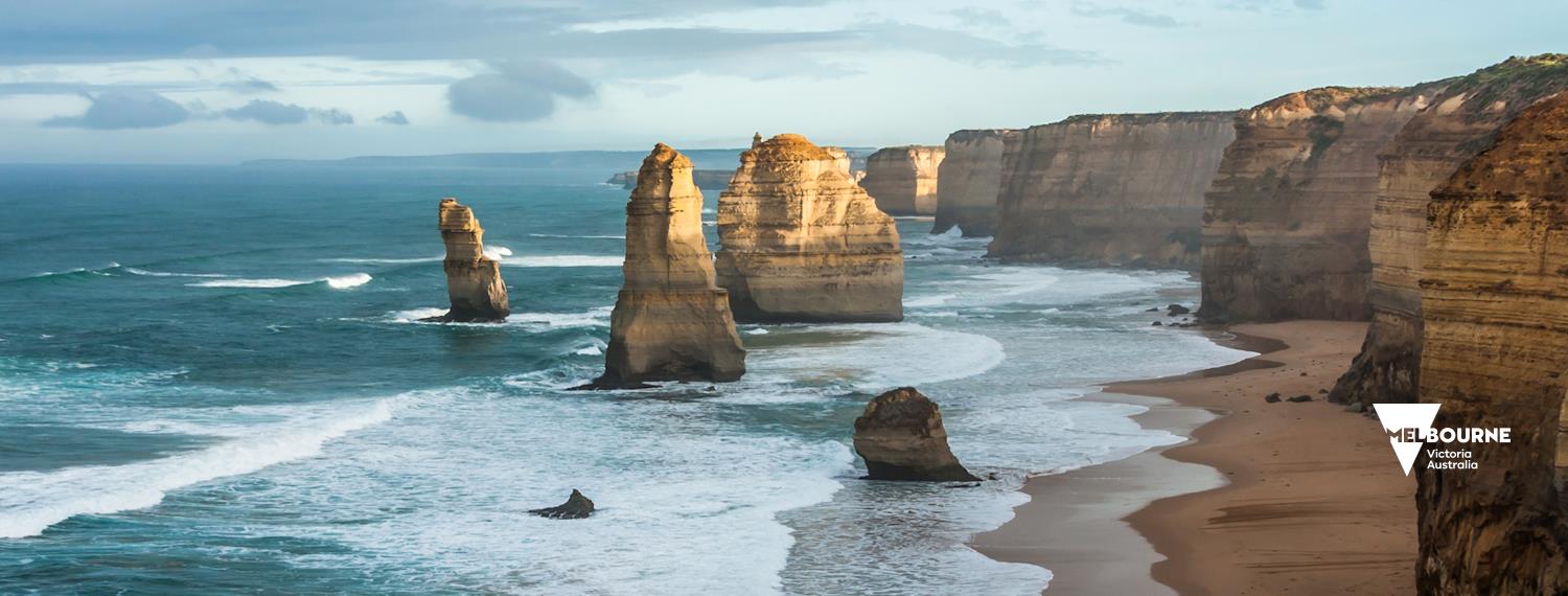
Header images are an important element of social media presence. They should be used as a canvas to express the brand – rather than as a place for campaign promotion or information.
Specifications:
1500px x 570px
Note: while this size does not match up perfectly to any social media platform, it’s a great balance and will work well across Facebook and Twitter, desktop and mobile platforms. These platforms will automatically resize your image to fit.
All header images should be uploaded uncompressed.
Generally, social media headers should NOT contain any text aside from the 'V' logo and associated tagline. If you need to use text in your social media headers please follow typography guidelines and ensure that the text is easily readable on desktop and mobile platforms and has sufficient clear space.
Safe area
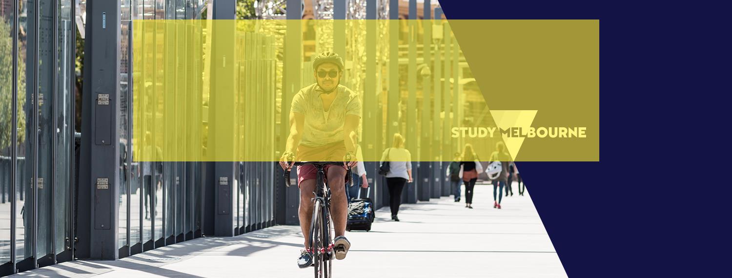
There is a common safe area of 955px x 292px. It is positioned 40px from the top of the header image and horizontally centered. Logos and main image focus should sit within this area to ensure that it is not cut off when viewed on mobile devices and different browser sizes. Any part of the image that sits outside of the safe area may be obstructed by text and other elements that are native to the social media platforms.
Design templates
Masterbrand
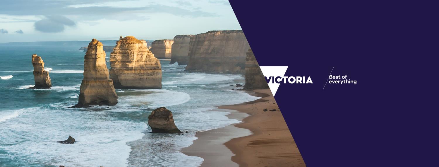
Contains the masterbrand logo inc. the 'Best of everything' tagline. Logo and tagline are vertically centered. The left-hand-side panel must contain an image or pattern that contrasts with the right-hand-side panel. The RHS panel must be solid #201547 colour.
State Government
The main State Government social media channels should use the above template with the State Government logo and contrasting LHS/RHS panels. Logo and tagline are vertically centered. The left-hand-side panel is usually a flat colour. If an image or pattern is created to represent the State Government, use that instead. The RHS panel must be solid #004ea8 colour.
Government departments
Government department social media channels should use the above template with the Department’s associated logo and contrasting LHS/RHS panels. Logo is vertically centered and fits within the safe area. The left-hand-side panel should be a flat colour or use a pattern if one is assigned to the brand. The RHS panel must be the associated main brand colour for that Department.
Government Divisions & Entities, Destinations
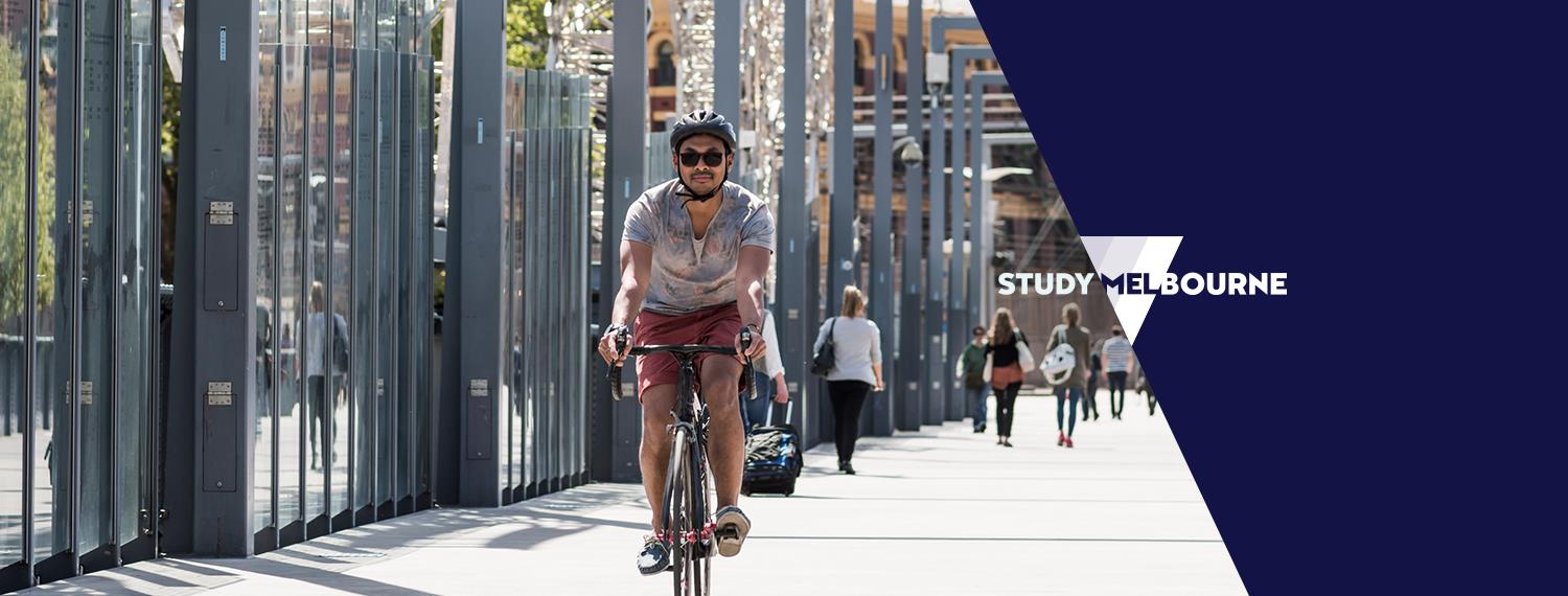
Divisions & Entities and Destination social media channels should use the above template with the relevant logo (i.e. Regional Victoria, or Study Melbourne) and contrasting LHS/RHS panels. Logo and tagline are vertically centered. The left-hand-side panel must contain an image or pattern that contrasts with the right-hand-side panel. The RHS panel must be solid #004ea8 colour.
Government Initiatives, Statutory Authorities and Government Owned Corporations, Campaigns, Independents
This template should be used for all Government Initiatives, Statutory Authorities and Government Owned Corporations and Independents with brands that don’t fit into the ‘Divisions and Entities’ template.
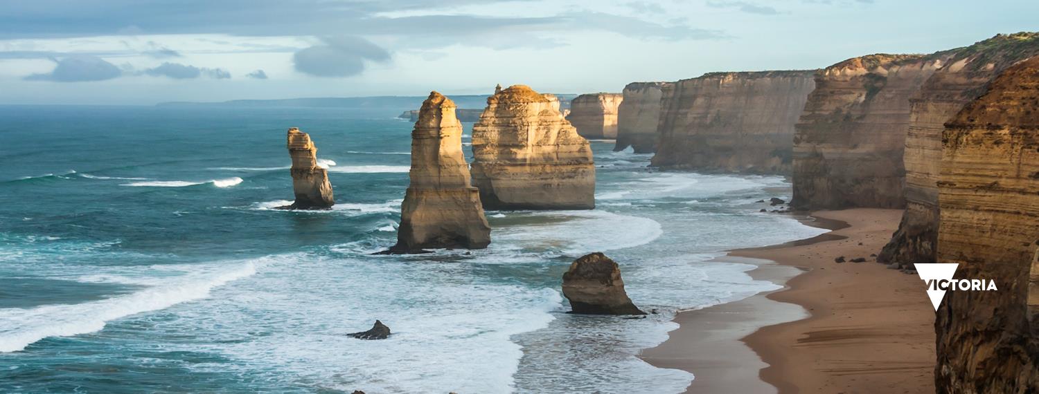
The relevant logo should be included in the bottom right corner (60px inset from RHS and 120px inset from bottom of the header image). Any brand image, colour or pattern may be used in the background. Ensure that the logo is not obstructed by other text or logos.
International campaigns
International campaigns should use branding and imagery from the campaigns, full-bleed. The appropriate brand logo (usually the 'Melbourne, Victoria, Australia' logo) should be used in the bottom right corner (60px inset from RHS and 120px inset from bottom of the header image).
Updated
