Selecting photographs for a banner or header imagery should be judged on a case-by-case basis. It’s difficult to define concrete rules, but there are some clear Dos and Don’ts that should guide your decisions. We’ve also included an example to illustrate each do and don’t below.
For more information about using text on top of images and accessibility, see Text on images.
Dos
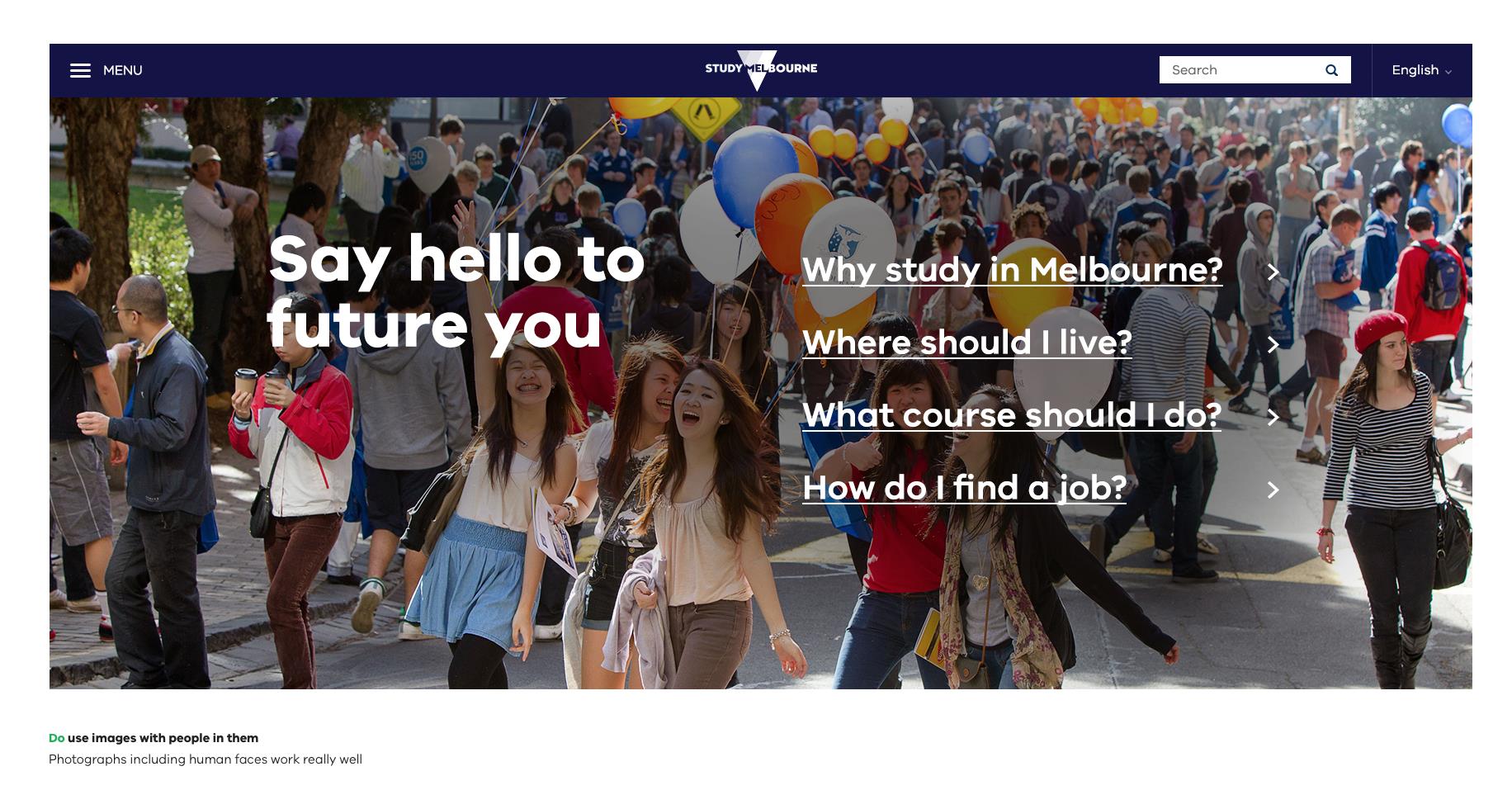
Do use images with people in them
Photographs including human faces generally work well. People in photographs should be engaged in an activity. Use common sense when selecting images – subject matter should be considered carefully.
Do use images that tell a story
Choose images that showcase what Victoria has to offer. Combine images and copy to tell a story. Photographs that don’t show people should still feel ‘alive’.
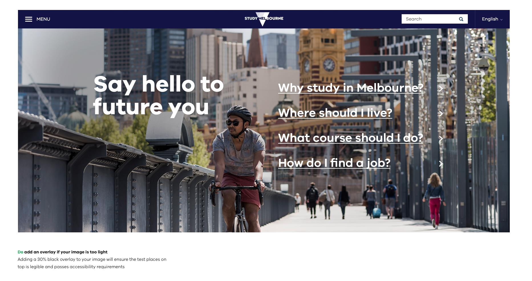
Do add an overlay if your image is too light
If there is not enough contrast between the text and image you are working with, and there is no alternative image, you’ll need to consider adding a 20%-40% black overlay if your chosen image is too light.
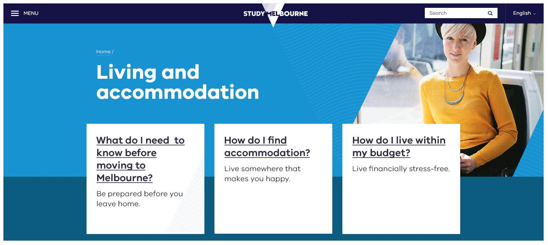
Do place text on flat colour to avoid accessibility issues
If using a background image is too tricky or it’s too hard to read text on top of a photograph it’s also great to use a big, bold colour for text to sit on in your hero banner.
Don’ts
Don’t use stretched or low-resolution images
Make sure images retain their proportions. Ensure images are large enough for the design.
Don’t use overly complex images
Complicated images can be distracting. These images can also make text inaccessible.
Don’t use images that are too light
Make sure there’s enough contrast between the type colour and the image behind it so that the combination is accessible. Adding a 20%-40% black overlay may help if your chosen image is too light.
Updated


