Although branding has been touched on throughout these guidelines, we’ve compiled the key points to make it easier to reference.
Branding is the easiest way to make a site feel unique within the Brand Victoria suite. Following typography, spacing, grid, etc rules will ensure consistency within the Brand Victoria family. But it’s important to evoke personality through colour, logos, pattern and photography, too.
A few recommendations have been outlined in terms of how to implement a sub brand across a site. They’re just starting points and should be expanded upon, depending on how closely aligned a brand is to the Masterbrand.
Logos
It’s really important to consider how multiple logos work together on a page and the relationship between them. It’s likely you’ll need to display a sub brand logo such as Study Melbourne plus the Victoria State Government on one page.
If this is the case, the sub brand logo must be given prominence. This could be done by placing the sub brand logo in in the header or main navigation. The Victoria State Government is secondary to the sub brand logo, as as such, might be positioned in the footer.
Logo size and clear space
Specifications
The minimum size of a logo is 60 pixels high for desktop. Scaling across devices means this will be different for each device. The table below breaks down the calculated size (similar to what we discussed in scaling typography). We must use the calculated size when designing, to ensure logos are visually consistent across all devices.
The minimum clear space is the cap height of any letter included in the tagline, for example, A.
| Device | Minimum visual height (height) | Scaling (relative to large desktop) | Calculated size |
|---|---|---|---|
| Large desktop (?900px) Thunderbolt display | 60px | 1x | 60px |
| Small desktop (?900px) Macbook Air | 60px | 0.8x | 48px |
| iPad Air Pro | 60px | 2x | 120px |
| iPhone 6+ | 60px | 2.5x |
150px |
| iPhone 6 | 60px | 2x |
xxxxx |
Taglines
Sometimes a sub brand might come with a tagline. If this is the case, there are a couple of rules to follow:
- the minimum size of a tagline is 60 pixel high for desktop. The above table for minimum logo sizes can be also used for taglines as they share the same requirements
- the minimum clear space is the cap height of any capital letter included in the tagline
Colour
Colour is the easiest way to personalise a site to your sub brand. Some good places to incorporate specific brand colours include:
- navigation bar
- large navigation tiles
- buttons
- header backgrounds
- footer
There’s also a WCAG Accessibility Matrix in the typography section which includes a list of all primary and secondary colours in the Brand Victoria palette, as well as the recommended text colours.
Patterns
Patterns add depth to designs where a flat colour may be too boring or an image would be too distracting. Places where patterns could be incorporated include:
- side by side or overlapping with imagery or photography
- on navigation tiles and elements
- page headers (e.g. standard content pages)
- as subtle background elements in various modules (i.e. contact details box)
A few examples of how to apply patterns are below.
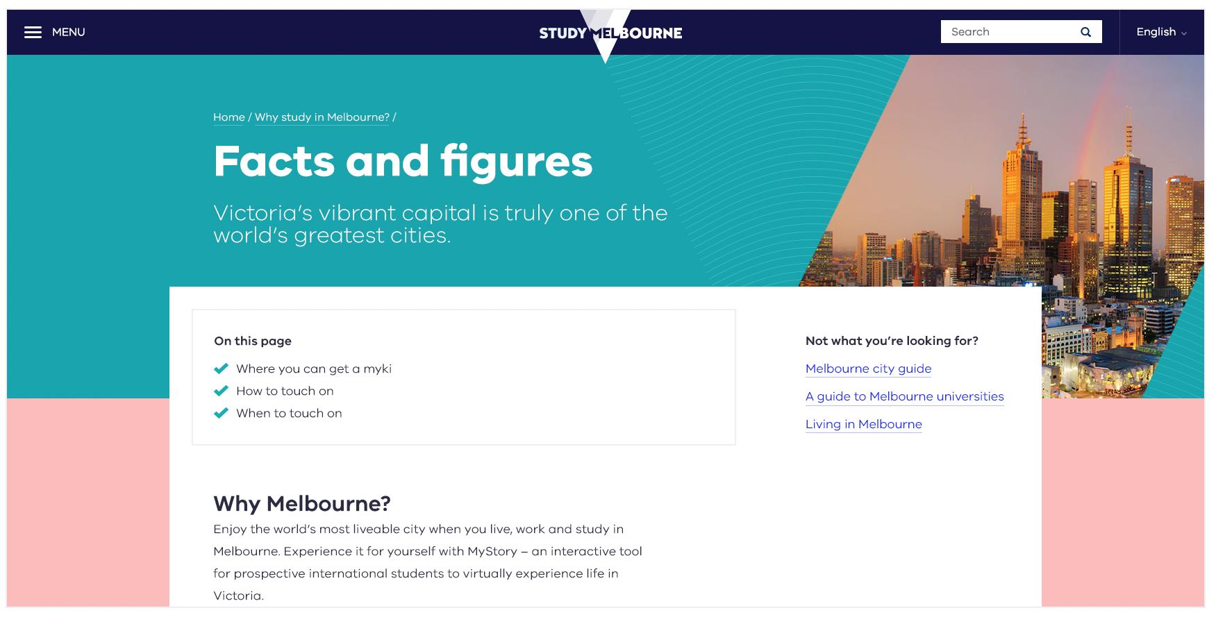
Above: An example of adding subtle patterns into header area, as well as using the intersection device to combine patterns and imagery. Brand colours have also been used.
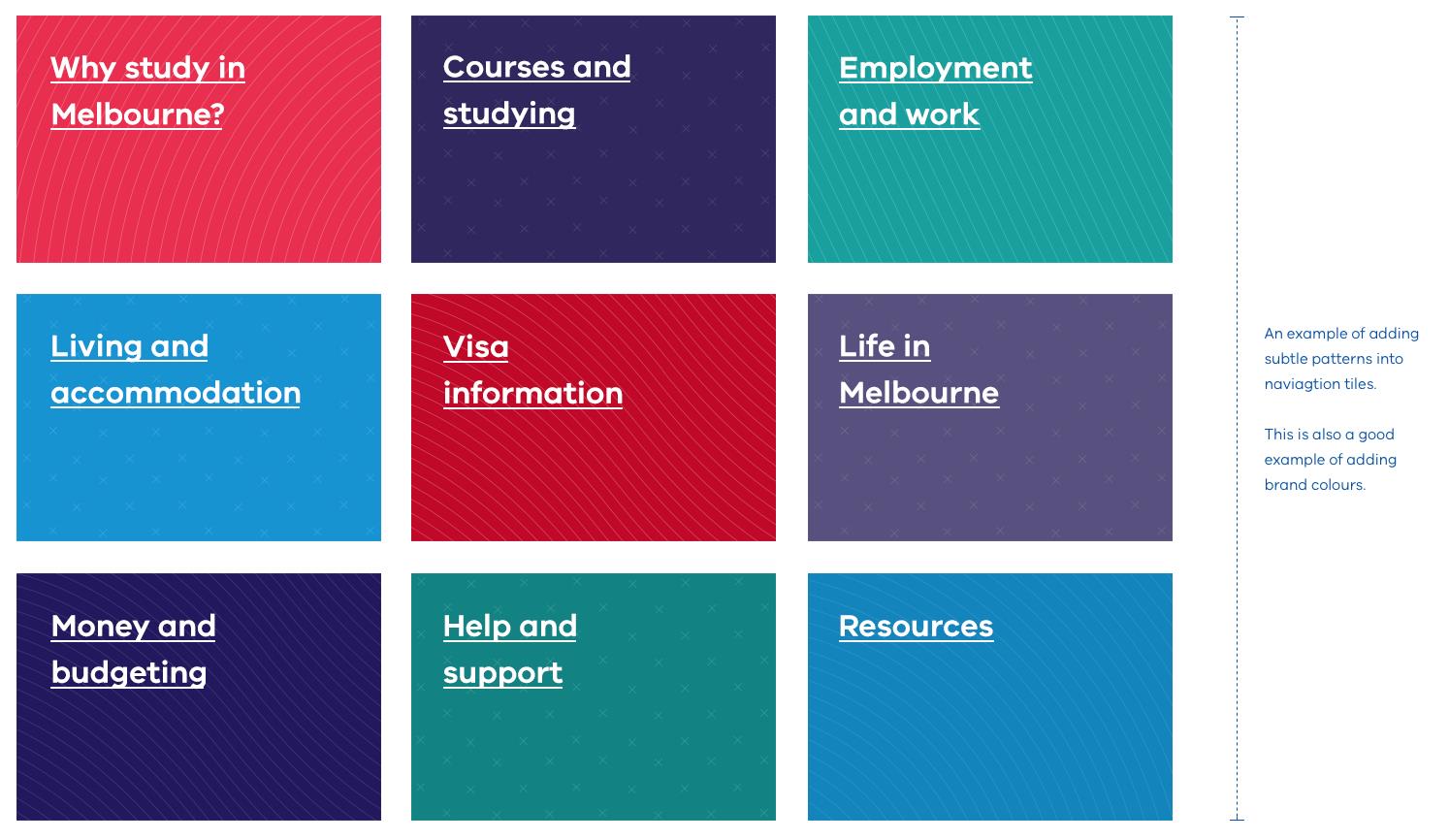
Above: An example of adding brand patterns to navigation tiles. Please note, these patterns are quite subtle and a heavy type has been used on top to ensure legibility.
Above: An example of adding subtle patterns into page modules (see right hand side).
Places where patterns shouldn’t be used include:
- small buttons: This is especially important when it comes to accessibility of text
- as a background: Big blocks of pattern can make the page overwhelming
- behind text: Most instances will result in the text being inaccessible due to poor contrast
The above rules can be broken if the:
- design remains functional and accessible
- design is consistent with the Brand Victoria family
- design intent requires so
- design is visually pleasing
Intersection device
The intersection device is an intrinsic part of the Brand Victoria identity, and a great way to add personality through logo placement, colour, patterns and photography. There are a couple of general rules to follow when it comes to applying the intersection device to your designs.
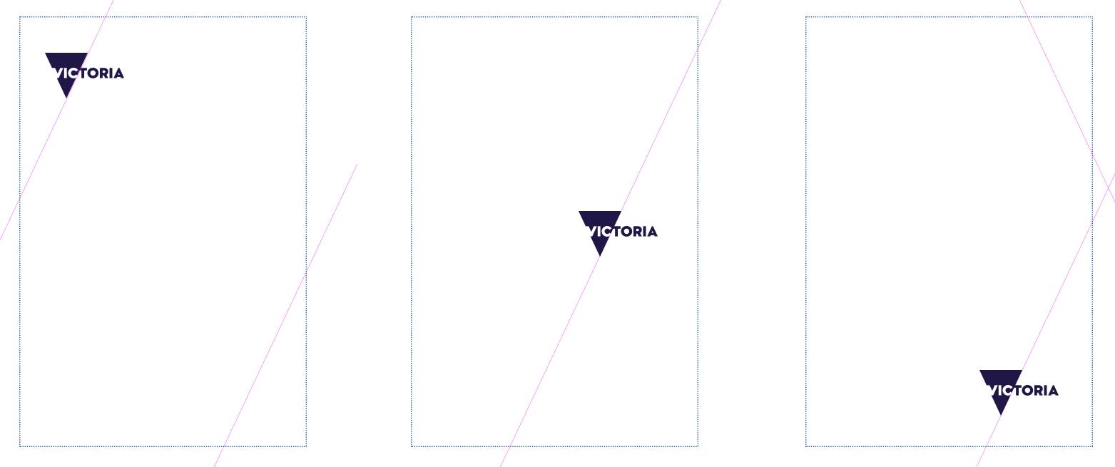
Angles: The intersection device should always follow the angles of the masterbrand triangle, as shown in the example below.
Lock-ups: The intersection device can be used to lock-up a sub brand logo to a photograph or block of colour. The logo can sit anywhere, so long as it’s aligned to the intersection.
Quantity: There should be no more than three sections as a result of applying the intersection device. This means there should be no more than two intersections applied to a particular component (for example, photograph, header).
Photography
Photography is a great way to evoke personality and tell the story of a brand. Each sub brand site will have different needs in terms of photographic style and content. Photography will need to be judged on a case-by-case basis, but the following points should help inform your decisions and keep Brand Victoria consistent.
Combining images
When combining images, consider implementing the intersection device. A couple of tips have been suggested below.
- the dominant colours in each image should work together harmoniously
- if there is an image horizon in both, try and line them up so the lock-up feels balanced
- avoid images with lots of visual clutter
Images with great contrast also work really well. There are lots of different ways contrast can be used. These include:
- contrasting subject matter (for example, natural vs built)
- contrasting image styles (for example, macro vs micro)
- contrasting location (for example, a sports event outdoors vs indoors)
- contrasting time (for example, day vs night)
Single images
The intersection device can also be used on individual images. This can be done with a solid colour or pattern over a solid colour. If doing so, keep in mind:
- intersection and image are balanced
- photography and colour combination should also be harmonious
An example of a single image is below.
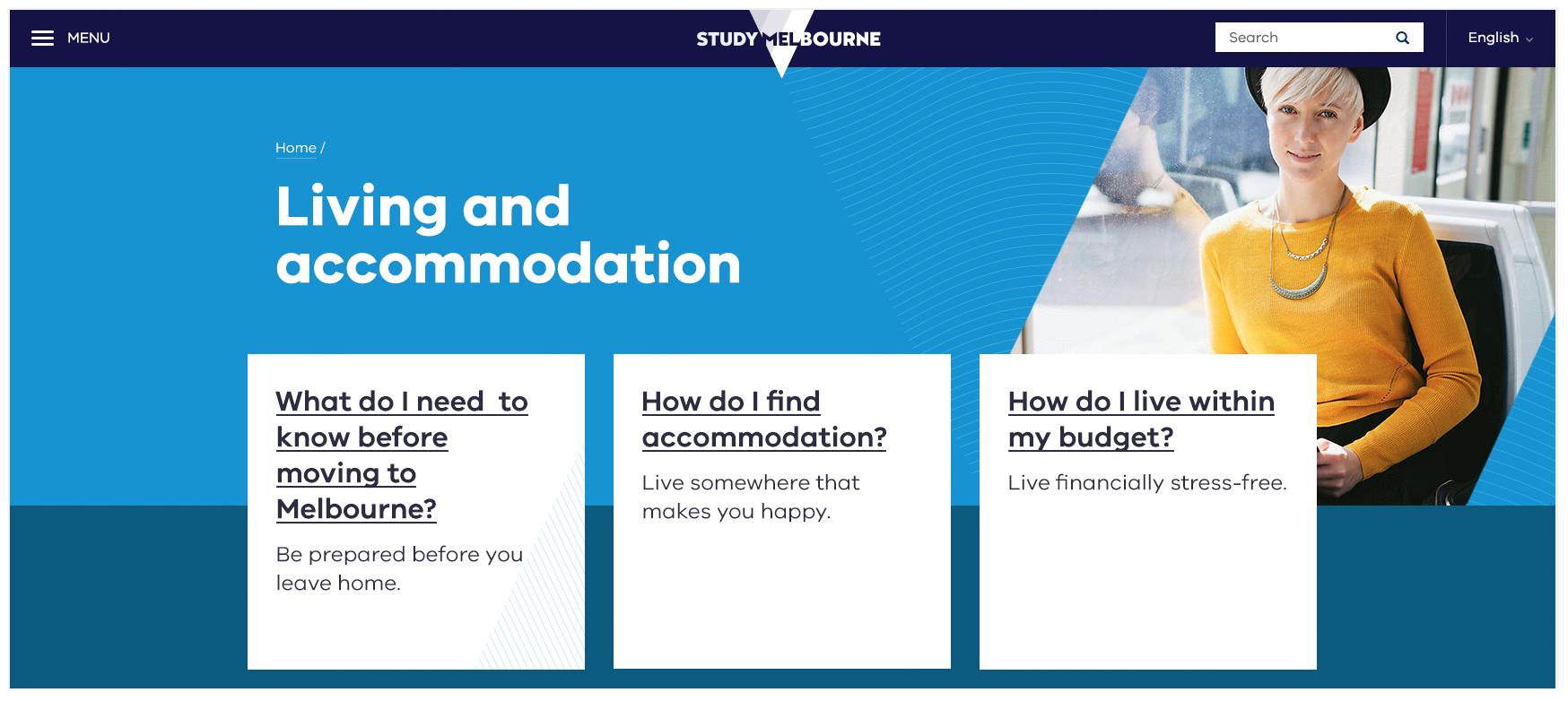
Above: An example of combining a single image with patterns and colour. This combination is balanced and the colours used are harmonious.
Generally, there are also a few things we should avoid when it comes to selecting photography.
What not to do
- don’t combine two closely cropped images if it makes either image lose context
- don’t combine two images that look too similar (e.g. they include the same subject matter or they’re both visually complex). It should be obvious they are two different images
- don’t combine images that have been treated differently. For example, a duotone image and a grayscale image
- don’t combine two images with bold horizon lines that don’t quite align
- don’t combine two images if they merge visually
Updated


