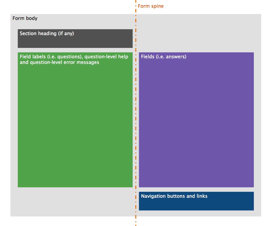
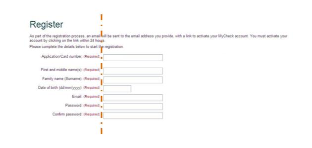
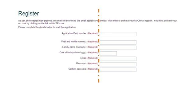
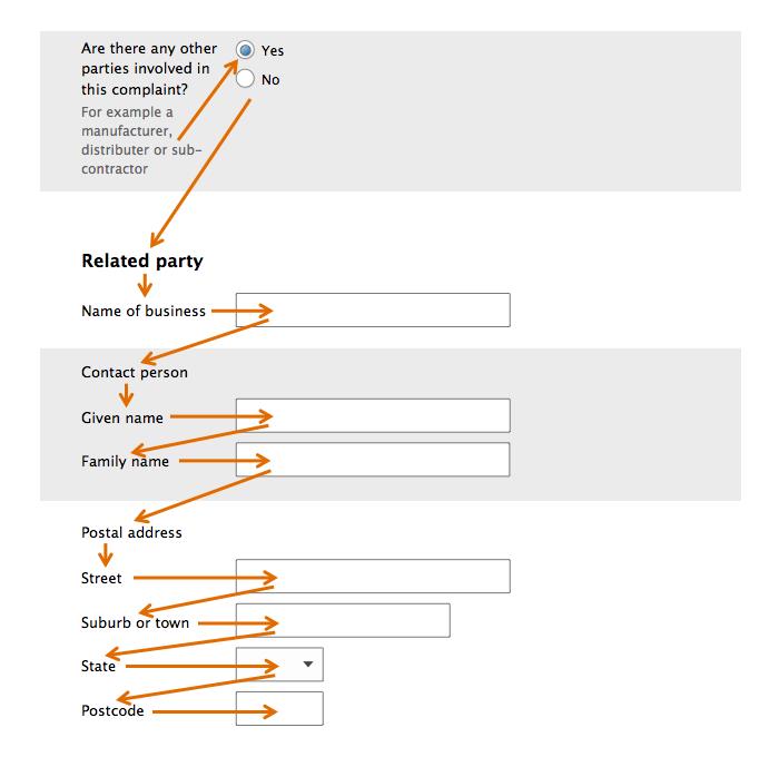
Text and colours
By default, and unless instructed otherwise in these or other applicable guidelines, text should be:
- black or very dark grey (for example #000000 or #0C0C0C)
- a non-Roman ('sans-serif', that is, without the small lines at the end of the character), typeface is highly readable on screen, especially at small sizes (for example Arial, Helvetica, Optima, Verdana, Tahoma, Open Sans). For more information, visit If It’s Hard to Read, It’s Hard to Do - USC Dornsife website (PDF, 51KB).
- set flush left
- actual text, not an image of text. If text must be provided via an image, ensure appropriate ALT text is provided.
- set relatively (that is, in ems or percentages, not pixels)
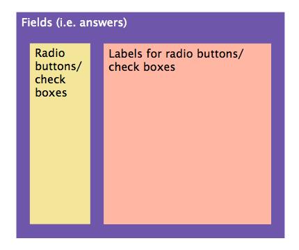
The size of text used for answers should be the same as for questions (including labels on radio buttons and check boxes). The background colour of a form should be white (that is, #FFFFFF), unless a different colour is needed to improve usability. If the background has a colour, it should be a tint of no more than 10%.
Because not all form-fillers can perceive it, colour should never be used as the sole method of conveying information. Except for very large text and help text, the contrast between text and background colours (for example on buttons) should be at least 8:1, as recommended by the W3C. Large text should have a contrast of 3:1. Help text should have a contrast ratio of 4.5:1.
Link text should be underlined, and in a different colour from the surrounding text. If link text isn't underlined, the contrast ratio for the link text colour versus the surrounding text colour should be at least 3:1. There are several free tools available for checking colour contrast, including:
- Contrast ratio - Lea Verou
- Colour contrast analyser - Vision Australia
- Colour Contrast Checker - WebAIM
For more information on colour contrast, visit the Contrast (Minimum) page on the W3C website.
Form title
Every form must have a unique, descriptive title. Avoid using redundant terms like 'form', 'online' or the name of the business unit (the header says this). Set the title in the largest font used anywhere in the form, and position it flush left. Programmatically, use the h1 element to mark up the form title.
When choosing a title, put the subject before the verb. This makes it easier to find the right form, as when searching, form-fillers are focused on the subject matter more than the related action.
The exception to this rule is forms within a user portal, such as the forms inside the Working With Children Check Unit’s MyCheck. In-portal forms are usually for performing actions on the user’s account, so are more appropriately named with verb before the subject.
When referring to a form in the text of a website, use the exact form title.
| Good title | Poor title | Example of reference in text |
|---|---|---|
| Birth registration | Register a birth | '...complete a Birth registration...' |
| General complaint | General complaint - Consumer Affairs Victoria | '...make a General complaint...' |
| (In a portal) Change your details | (In a portal) Details change | '...change your details within 21 days...' |
Contact information
Form-fillers should have access to telephone support during appropriate hours. Telephone support enables form-fillers to move past blocks — such as being unsure how to answer a question — in the most frictionless way (that is, while still on the relevant screen of the form).
In turn, for the business unit, this improves data quality and reduces costs. Data quality is improved because on required questions, form-fillers can give accurate answers (rather than guessing or providing nonsense answers, just to get past validation).
The Working With Children Check Unit experienced inserting of nonsense answers first hand. When a field was required but some form-fillers legitimately didn't have any answer for it, the Unit started receiving submissions with spaces, dashes, full stops or other single characters entered.
Costs are reduced because:
- it's easier and more efficient to help a form-filler at the point where they incur the issue, rather than later
- improved data quality means less staff time spent addressing data issues after submission
- always-visible contact information provides psychological reassurance to form-fillers, and helps build trust. It says: 'if you need help you'll be able to get it easily'. This makes form-fillers more willing to try completing the form online, and increases adoption of this more cost-effective channel
- Making it easy to contact the owning organisation is one of Stanford University’s 10 guidelines for building site credibility. These guidelines are based on the considerable research done by the Stanford Persuasive Technology Lab — three years and 4,500 people — as listed on their website
Moreover, if they need it, form-fillers will find contact information one way or another. Thus, displaying the details on the form will not significantly increase call volumes, yet it will improve form-filler satisfaction.
How to provide contact information
Provide a brief description of the support and its availability (days, hours and time zone), for example:

Make this information always visible no matter what step of the form the form-filler is on. Contact information can be set flush right.
Form headings
Form title
As mentioned earlier, every form has at least one heading: the form title. The form title is the largest font in the form.
Step headings
Single-step forms don't need a step heading; the form title suffices. Multi-step forms should have a heading for each step. This heading should be set flush left, in a font that is smaller than the form title but larger than message headings. Programmatically, use the h2 element for step headings.
Step headings should be brief (that is, 1–5 words). Avoid the use of redundant terms like 'details' and 'information'.
Summary message headings
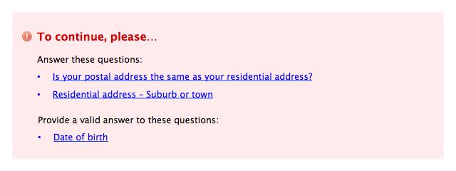
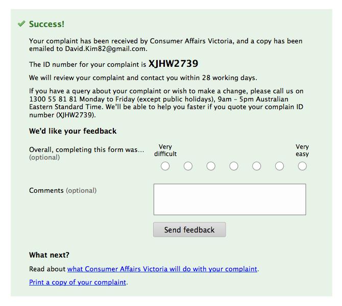
Boxes showing summaries of errors, warnings or feedback should include a heading, as follows:
| Message type | Heading |
|---|---|
| Errors | To continue, please... |
| Warnings | Note |
| Reinforcement | Success (or equivalent) |
| Information | Important |
The font for message headings should be smaller than step headings but larger than section headings.
Section headings
Avoid section headings (but not necessarily sections themselves). Research shows form-fillers often use section headings to decide whether they need to complete the section, so section headings increase the chance of errors.
Where used, section headings should describe what the section is about. Never use a section heading to ask a question.
The font for section headings should be smaller than message headings but larger than that used for field labels and question-level help. Like field labels, section headings should be set flush left:
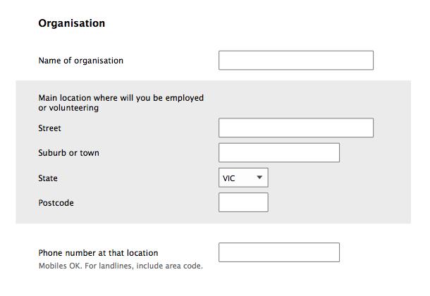
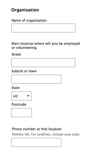
If a form screen is broken into sections, programmatically the fieldset element and legend tag should be used to create and caption the sections for screen readers. To mark up section headings, use the h2 (if the form is single-step) or h3 (if the form is multi-step) element.
Page title
Every screen of the form should have a unique and meaningful page title (that is, the browser tab or window label), marked up using the title element. By default, the page title should be 'Step heading – Form title'. The business unit name can be appended to the page title.
Progress indicator
Display a progress indicator when a form has more than one data-entry step, not counting Eligibility or Review (refer to Layout of forms - key screens). The exception is when the form is being viewed on a mobile/small screen. In this case, the progress indicator should be a simple label indicating which step the user is on, and the total number of steps contained within the form for example 'Step 1 of 5', 'Step 2 of 5', etc.
Because the steps in the form must be completed in a specific, linear sequence, sometimes with dependencies between steps, no parts of the progress indicator should be clickable. If a multi-step form has no dependencies between steps, and steps can be completed in any order, a tabbed form design should be used rather than a progress indicator.
A standard for the design of a tabbed form isn't provided here because at the time of writing, there were no prototypical forms of this type. Moreover, the tabbed form is relatively uncommon on the web, and so international best practices aren't yet established. If you use a tabbed web form in the future, test the design thoroughly with users before going live.
The progress indicator should have one 'node' for each step in the form, including Review but excluding Eligibility (page 101) and Completion (page 106). The label for each node should be exactly the same as its corresponding step heading. don't number steps or use redundant terms like 'step' or 'page'.
Each node can have one of three states:
- current step
- step yet to be started
- completed step
Each state should have a different background colour, with the current step being the most visually prominent. Default colours should be:
| Node state | Background colour |
|---|---|
| Current step | Brand colour, ideally primary (provided sufficiently different from grey or green) |
| Step yet to be started | Grey (for example #BFBFBF) |
| Completed step | Green (for example #D2FABE) |
Completed steps should also have a tick icon (for example in colour #327828). Reinforce the sequential nature of the form by linking nodes with a directional arrow. Make sure there's enough space between nodes so that their labels don't come to close to each other. If necessary, wrap labels, but ideally not over more than two lines. Node labels should be set centred, vertically aligned with the middle of the node.
An example of a progress indicator that meets these requirements is shown below. 'Mother' is the current step:
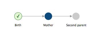
In the progress indicator, don't include Introduction, Eligibility or Completion. (Refer to Layout of forms - key screens.)
The content of the progress indicator should be conveyed to screen reader users (for example use ALT text for nodes — if nodes programmed using HTML images — or hidden CSS — if nodes are CSS background images).
Numbering
Sub-questions
Don't number sub-questions.
Questions
By default, questions should not be numbered. Number questions if you need to refer to them.
Question numbering should be in numerals (that is, '1, 2, 3…'). If you are numbering questions, your questions will usually be long and thus flush left. In such cases, there should be a hanging indent so the question number stands out from the text. The numbers can be written either with a prefix of 'Q' and without a full stop, or without the 'Q' and with a full stop:


When referring to questions, use 'Q' if this prefix is being used when numbering (as per example above left). Otherwise, write 'question' (as per example above right).
Question numbering continues sequentially across sections and steps. For example, if the last question in a step is Q21, the first question in the next step is Q22.
Sections
Don't number sections.
Steps
By default, step should not be numbered. Numbers make it harder to scan the step names, and over-emphasise that the form has many steps.
Space and dividers
Ensure there's sufficient vertical space between form components. The space between components of the same type (for example between questions) should also be consistent.
Borders and dividers — for example, between questions or sections — are ineffective separators. This is because their lines compete with the borders of text fields and drop downs:
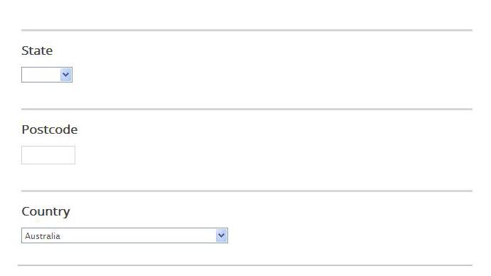
As such, separating borders and dividers should not be used. Instead, the relationship between elements should be conveyed through the adjustment of space, particularly in the vertical.
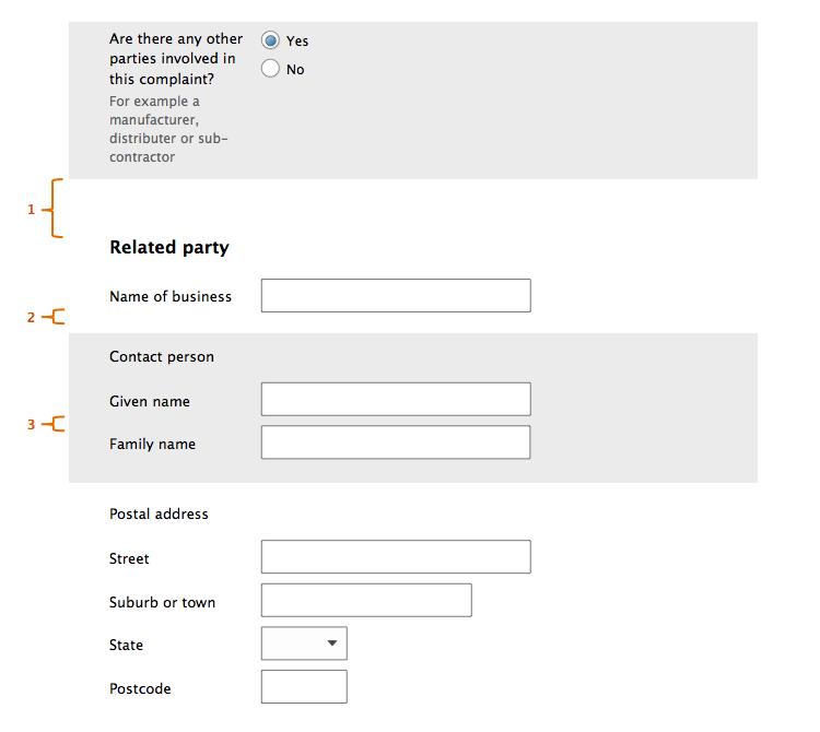
In the illustration above, the greatest vertical space is between sections (1). there's less vertical space between questions (2) and the least vertical space is between sub-questions (3).
The underlying principle at work here is that humans see objects that are close to each other as related, whereas objects that are far away from each other are seen as not being related. This is the Gestalt Law of Proximity.
Use this principle throughout the form, including communicating:
- which labels go with which fields
- which tips go with which labels
- which radio buttons or check boxes form a set of response options
- which sub-questions make up a question
Zebra striping
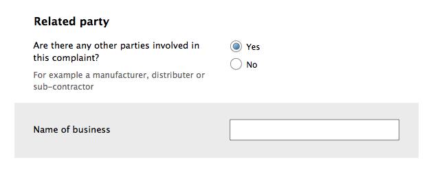
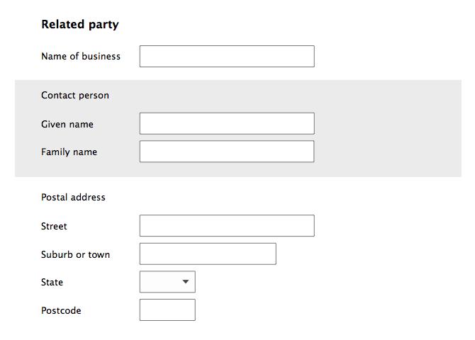
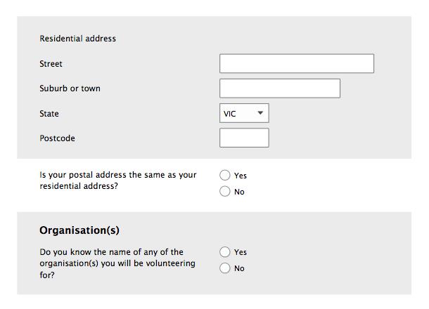
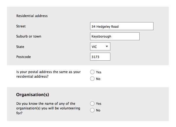
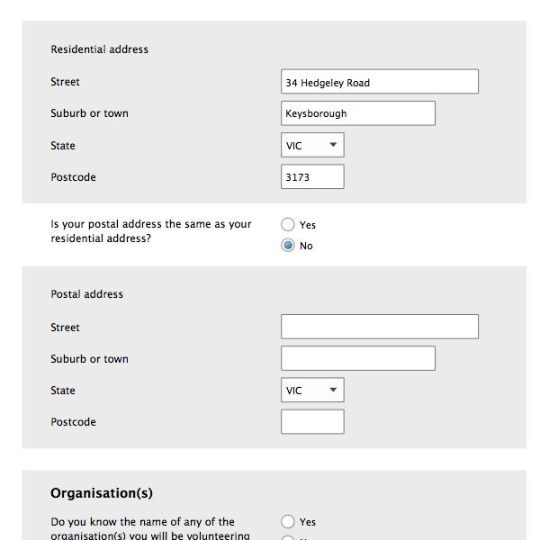
When additional separation is needed, zebra striping works well. Zebra striping is the alternate application of a very light grey tint (for example #E6E6E6):
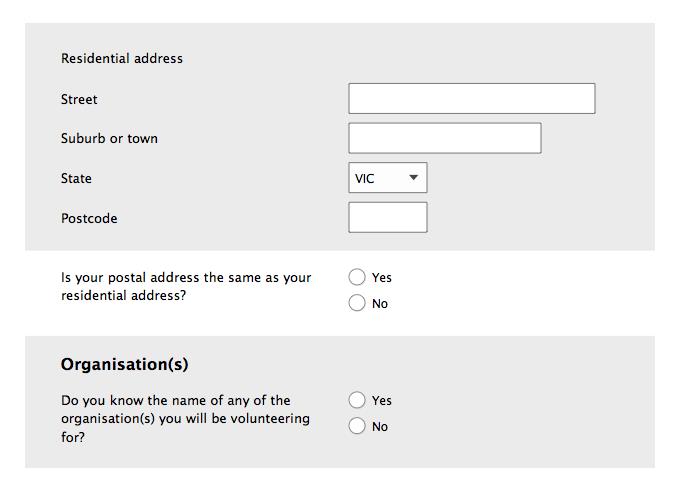
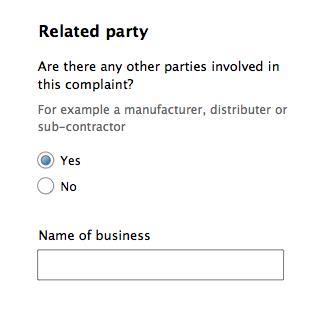
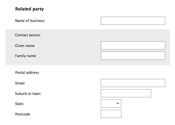
When field labels are positioned to the left of fields, zebra striping must be used, to help visually connect the labels to the fields.
When using zebra striping:
- the first application of shading should be to the second question on the form (or step, for multi-step forms)
- striping should continually alternate by question, regardless of any sectioning
- whenever the first question in a section has striping, if there’s a section heading, the striping should include the heading too. This is so that the section heading doesn’t get visually separated from the first question in the section
- don't be concerned if the showing of conditional fields leads to two striped or two non-striped questions being displayed next to each other
For more information on zebra striping, visit:
- Zebra Striping: Does it Really Help? - A List Apart website
- Zebra Striping: More Data for the Case - A List Apart website
Case
All text should be in sentence case. This means capitalising the first letter of the first word (of the title, label, tip etc) but not capitalising any other letters:

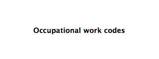
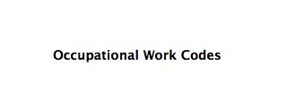
Don't use title case, which is where the first letter of every word is capitalised:

For emphasis within a piece of text, use bold:

Don't use upper case for emphasis; because we encounter them infrequently, upper case words are more difficult to read than lower case words.

For more information, visit The Science of Word Recognition page on the Microsoft website.
Fields - overview
Text fields
Except for dates, there should only ever be one text field per label. This means numbers like ABN or credit card are to be collected via a single text field, rather than multiple text fields (one for each 'chunk').
Do this:

Don't do this:

Taking this approach eliminates the problems associated with using a field for each chunk, namely:
- if you tab automatically between chunks, this will be unexpected behaviour for some users, and lead to errors
- if you don’t tab automatically between chunks, this will be unexpected behaviour for some users, and lead to errors.
For more information on auto-tabbing, visit Why we care more about effectiveness than efficiency or satisfaction - GDS user research blog.
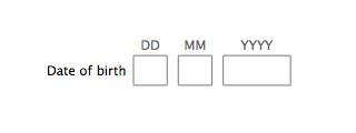
Dates are an exception because they are actually three fields combined into one: day, month and year:
Attachments
Where attachments can or must be uploaded with the form, follow this structure:
- 'Attachments' heading
- clear description of what should or must be attached
- bullet points on acceptable file types and sizes
- files (as they are attached)
- button to select file.
For example:
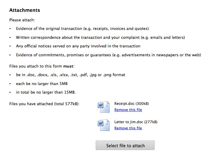
The button to select a file should bring up the operating system’s file explorer tool. The screen should stay anchored to the Attachments section throughout the attachment process.
Messages in forms
At a form- or step-level, 'messages' includes:
- text about required fields, that is, 'All questions must be answered unless marked '(Optional)'.
- step-level help
- general information
- summaries of
- validation failures (that is, errors)
- warnings
- positive feedback (that is, reinforcements).
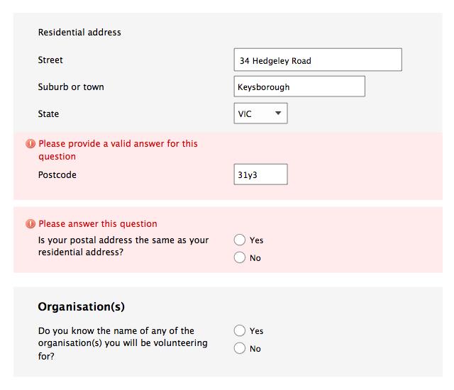
At a question-level, 'messages' refers to individual errors, warnings and reinforcements.
By default, and aside from any headings, all messages should be presented in the same font size, weight and colour as questions.
All messages should be written in plain English, with a polite, non-accusatory, tone. For errors, the focus should be on what must be done in order to progress, not what was done 'wrong'.
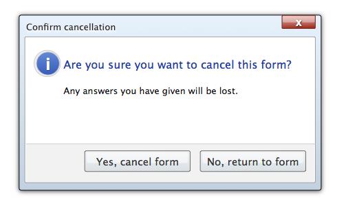
Except for warning messages about cancelling or timing out of a form, all messages should be within the form screen, not in a modal window.
Updated
