How to approach layout
Form usability is greatest when the layout of the screen is clean, simple and clear. To achieve this, start with a blank screen and think carefully before adding each visual element.
Only add elements if they help communicate with the user. For instance, colour should be used sparingly, and only to convey brand or to highlight (for example, main action buttons and error messages).
Remember, each visual element you add has to be processed by the form-filler’s eye and brain, increasing cognitive load and error rates while decreasing completion times and user satisfaction.
Vertical path to completion
A form will not only be aesthetic, but also be filled the fastest, if there's a single vertical path to completion. This is when the left edge of all the fields, and the main navigation button, is consistent:
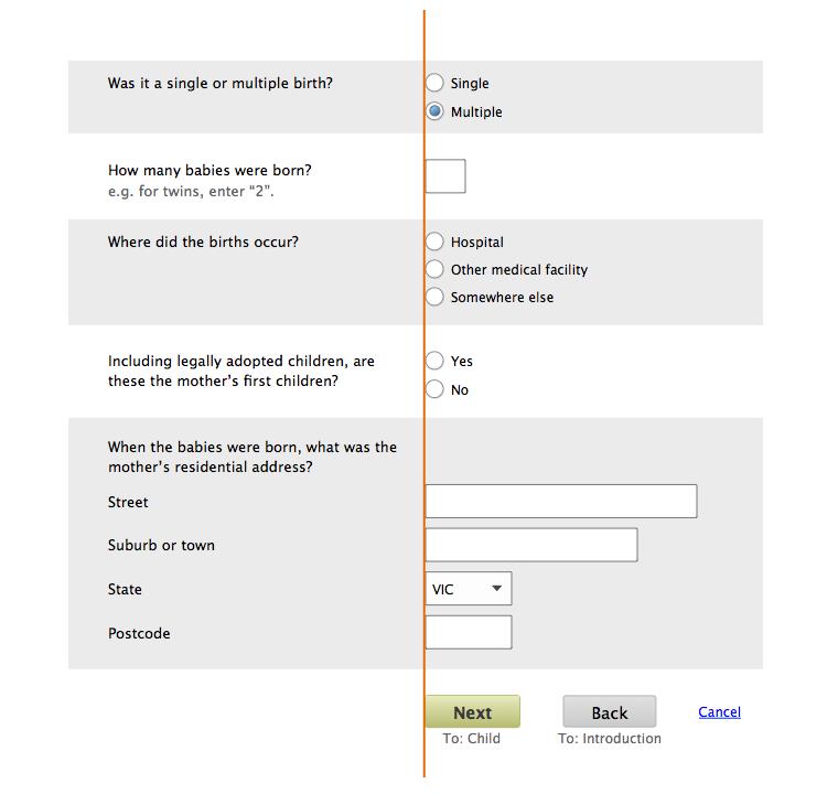
Edges
Another way to ensure the layout feels clean, simple and clear is to minimise the number of 'edges' in the form. Edges are created by all form components but especially:
- questions
- text fields
- buttons
- margins and padding
Minimise edges by:
- aligning elements vertically (for example, making sure questions are all vertically aligned)
- minimising the number of different widths for form components
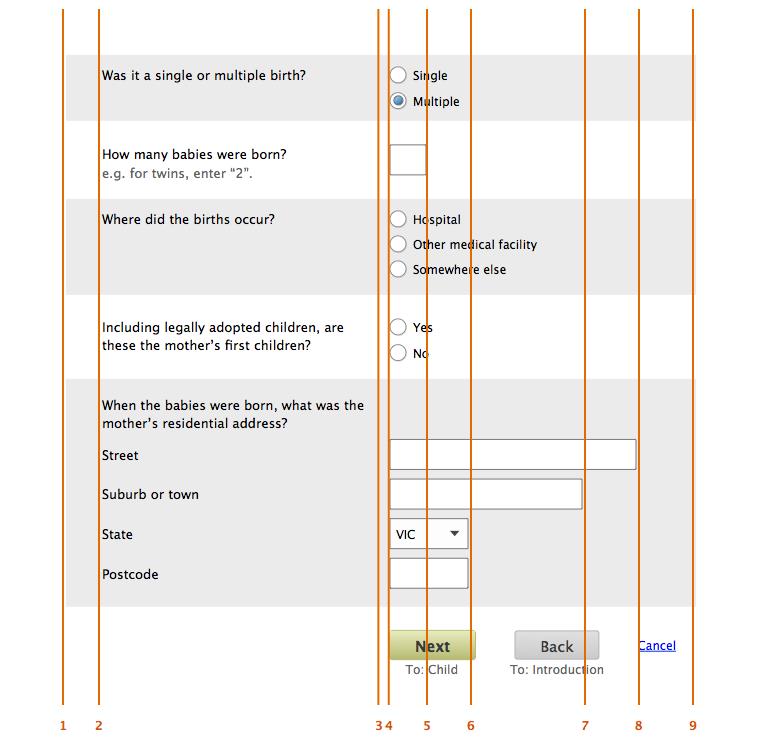
Below is a form that has been laid out in this way; main edges are marked. Even with good alignment and no more than four different text field widths, there are still nine edges on the screen.
For more information about alignment and widths, see Fields – overview in Layout of forms - key components
Slick pipeline
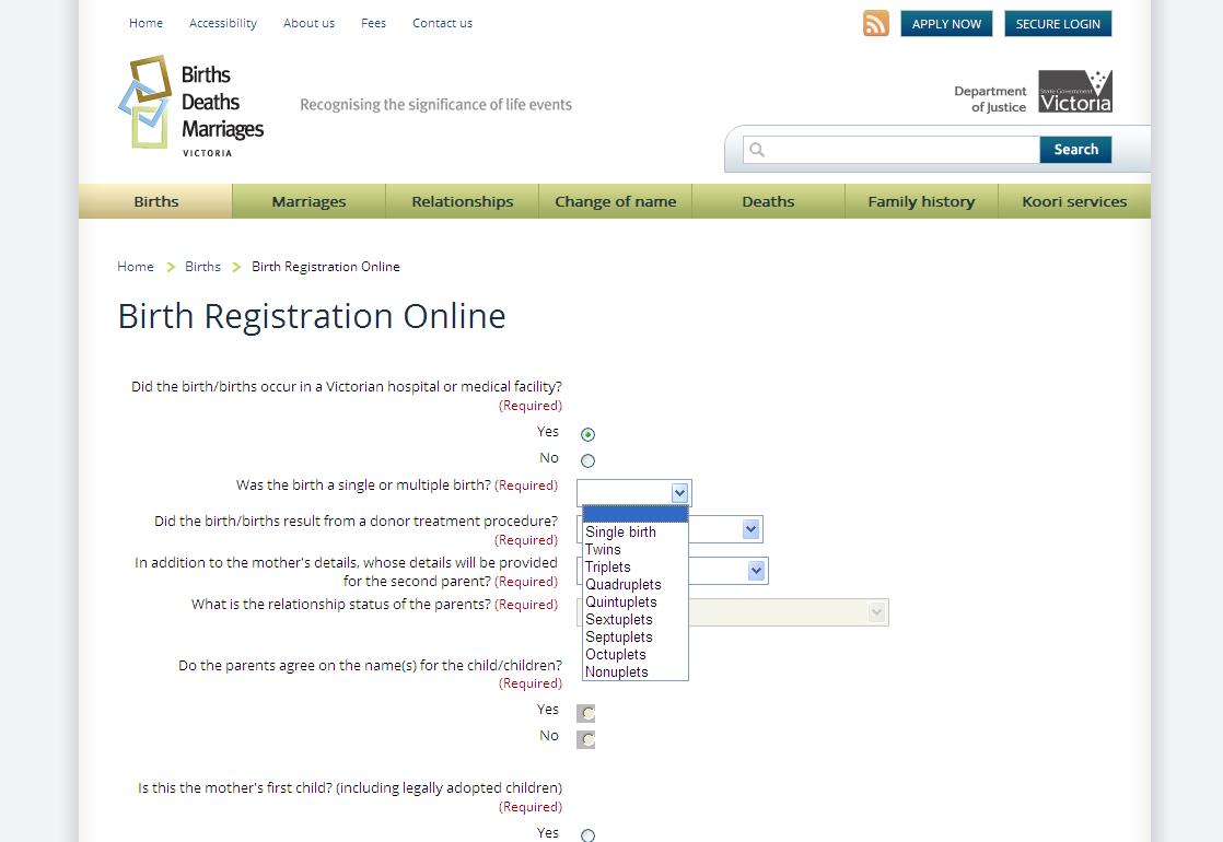
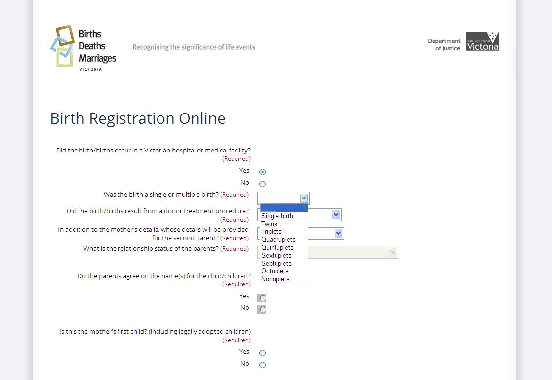
Once a form-filler enters a multi-step form process, we want to do everything we can to help them get quickly and successfully to the finish. This includes minimising distractions and the chances of accidentally leaving the form. The term 'slick pipeline' refers to the creation of this streamlined view of the form, to help propel the form-filler from the start to the end.
How to achieve the slick pipeline:
- Start from the first data entry screen after Introduction and Eligibility (see Layout of forms - key screens for guidance)
- Remove these site-wide page components:
- navigation (in header and primary)
- search
- breadcrumb trail
- login buttons and links
- footer
- Keep the following site-wide page components:
- logos for business unit, for example, Department of Justice & Regulation and Government of Victoria
- business unit tagline (if any)
For example, don’t do this:
Do this:
Editing
In a form, answers can have 1 of 2 states:
- editable
- not editable
Editable answers are answers the form-filler can change. In the body of a form, standard form fields are in their editable state. The opposite is answers that are not editable. This includes answers presented back to the form-filler at the review stage, or other data that can't be changed. Present editable answers via standard form widgets in their default state, with a white background.
Present not-editable answers as:
- read only text (remove the label element from any form labels)
- without any form widgets
- with bold font
- with tighter vertical spacing
- with the same background colour as the rest of the page
Question styling shouldn't change, regardless of whether or not the answer is editable.
An editable single choice question:

A not-editable single choice question:

An editable address question:
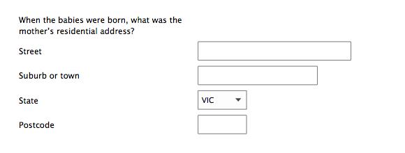
A non-editable address question:

Pre-population
In some cases, answers may be provided for the form-filler. This is 'pre-populating' 1 or more form fields. A field may be pre-populated with information already provided by the form-filler (for example, current address) or a default selection (for example, state of 'VIC').
When possible, pre-populate forms with information already provided by the form-filler. For best practice guidance, see Defaults (see Q&A in forms for more information). Pre-population shouldn't change the styling of a field in any way.
Structure of the screen
Every form screen has the same overall structure, as illustrated below.
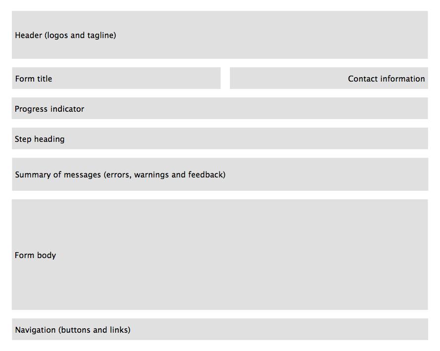
A progress indicator and a step heading will be present only for multi-step forms. Examples of each of the screen components is shown below:
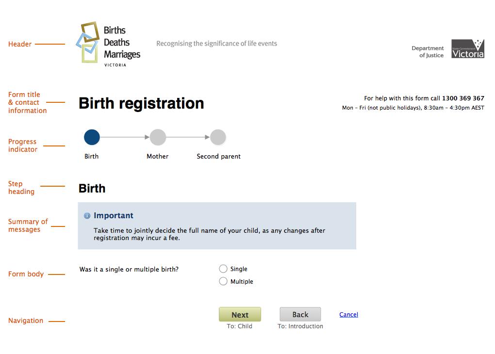
Note: on mobile/small screens, the progress indicator should be a simple heading indicating which step the user is on, and the total number of steps in the form, for example 'Step 1 of 5', 'Step 2 of 5', etc.
On mobile/small screens, contact information should appear below the form title. On larger screens, the container for the whole structure — but not necessarily the individual components — should be centred on the screen.
Tab order
The tab order for the form should be set to reflect this visual order (with contact information coming between form title and progress indicator).
Help
What makes for effective help
Effective help is timely, useful and complementary.
Timely
Place help at the point where it's needed, no sooner and no later:
- help relating to a question goes with the question
- help relating to a section goes at the start of that section
- help for a whole step goes just under the step heading
- help for the whole form goes at the start of the form
Using this approach, there should be no or minimal need for separate help files or FAQs, 2 notoriously unusable interactions.
Useful
Help must provide information useful to the form-filler, while attempting this specific task.
Do explain:
- what format data should be provided in (if restricted)
- unfamiliar concepts
- unexpected forbidden characters
- legal jargon
Don't:
- repeat content provided elsewhere (including in the question)
- include help that could be generic to any form
- explain how to interact with the form. If you feel explanation is needed, the design probably needs more work to make it intuitive
Complementary
Research repeatedly shows that in a huge number of cases, instructional and help text is not read. Because of this, help should assist the form-filler, but not be necessary to complete the form. Sometimes assisting the form-filler is about reassuring them, for example, if a question is likely to seem strange, intrusive or offensive.
Presentation
Form, step, and section-level
- use the form’s default typeface, font size and weight
- facilitate scanning through use of headings, short paragraphs and bullet points
- set flush left
Question level
All question-level help must go after the question and before the field, so it's available exactly when needed. Question-level help must be shown at all times (that is, not just when focus is on the corresponding field).
Use a grey text dark enough for sufficient contrast with the background of the form — including zebra striping — but light enough to be sufficiently distinct from the black used for field labels. A suitable grey would be #646464.
There are three types of question-level help:
- additional information
- formatting instructions
- character counters
Additional information
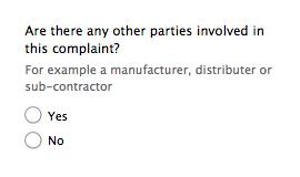
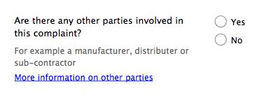
Additional information is a supplement to the question, that is, does not need to be read in order to answer (but may be useful for some form-fillers, especially edge cases). Visually, put extra information under the field label:

If the extra information is long, show an introductory statement or two and then follow with a link to more detail (the link opening a modal window):
Formatting instructions
Formatting instructions include:
- specifying how dates, phone numbers etc must be typed into text fields (if restricted)
- listing unacceptable characters likely to surprise form-fillers
Formatting instructions only differ from additional information in their placement. Formatting instructions must be located above the relevant field:

Character counters
Character counters must be shown before all multi-line fields, as follows. Character counters must always be on a separate line from any other formatting instructions. Putting the counter before the field means all form-fillers, including those using screen readers, know about the limit before they start to provide their answer. Use the aria-live property to announce with screen readers when the limit has been reached.
Initially:

After some characters have been entered:

When the form-filler has gone over the character limit:

Don't automatically truncate, as this behaviour may not be seen by the form-filler (especially if they are pasting text from another source).
The character limit must be set high enough so the vast majority (for example 95%) of form-fillers will never reach it.
Updated