How to decide on flow
Decide on flow using a ‘bottom-up’ — rather than ‘top-down’ — process:
- decide on the list of questions to ask, including any eligibility questions plus conditional questions and their corresponding triggers (see the section on Conditional fields in Layout of forms - key components)
- work out what would be a logical order for those questions (see Question order in Flow of forms)
- look for natural groupings for questions (for example, putting all questions about the mother together, or putting all contact detail questions together). 'Natural' here means natural to the form-filler, not government
- put the eligibility questions at the start as a single step
- review the number of steps that would result if each group of remaining questions were given its own step and, if needed, combine or split steps (see Number of steps in Flow of forms).
- avoid splitting topics across a step
- if whole steps are conditional, consider having the corresponding trigger questions at the start of the form, to tailor the experience (see Eligibility versus tailoring in Forms layout - key screens).
Key choices
Question order
To determine question order, the best way to think about the form is as a conversation. The key principles of successful conversations that apply to forms are:
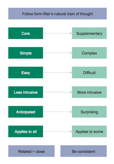
- Follow the form-filler’s natural train of thought. For example, when registering a birth, form- filler’s are likely to be thinking of the baby first, then probably the mother, then the second parent.
- Collect ‘core’ information first, then ‘collect’ supplementary information. For example, in a complaint form, the ‘core’ is the complaint itself, whereas the supplementary information is the complainant’s contact information. This is a particular instance of following the form-filler’s natural train of thought.
- Ask simpler, easier and less intrusive questions before complex, difficult and intrusive questions. This eases the form-filler into the process.
- Ask anticipated questions before surprising ones. Dissatisfaction comes from not meeting expectations.
- Ask questions applicable to everyone first, then ask questions applicable to only some form-fillers.
- The more related two questions are, the closer they should be to each other.
- Be consistent in question and sub-question order. For example, if you collect email before phone in one part of the form, collect email before phone in other parts of the form.
These principles are summarised in this diagram:

Often, these principles may be in conflict with each other and, or with, what seems like a logical order or natural flow for the form. This is because good form design is as much an art as a science. Having said that, usability testing can be an extremely useful way to inform this art, providing guidance on which principle is more important in the given context.
Number of steps
Scrolling versus paging
Because some people prefer scrolling while others prefer paging, there is no hard and fast rule about the number of steps a form can or should have.
However:
- Testing shows that online forms should have no more than five steps, with seven the absolute maximum.
- Research supports the idea that paging breaks the form-filler's flow more than scrolling does, especially when validation errors occur. For more information, visit Usable error message presentation in the World Wide Web: Do not show errors right away - ScienceDirect website.
As such, you should lean toward fewer, longer screens rather than more, shorter screens.
Avoid the extreme
For a lengthy form, when it comes to scrolling versus paging, there are two extremes:
- One very long screen (i.e. lots of scrolling).
- A large number of very short screens (i.e. lots of paging).
Regardless of which option it is, extremes lead to poor user experience. So:
- Avoid too much scrolling:
- a long form all on one screen can appear overwhelming. Putting steps inside collapsible 'accordion' sections can mitigate this issue, but accordion forms are difficult to implement well (for example, so as to not break the back button) and this type of interaction can be significantly more confusing for form-fillers.
- higher risk of losing data as not sent to server until whole form is complete
- higher risk of the form-filler losing their place
- whenever validation is performed, the form-filler will be presented with relatively more errors
- can be difficult on mobile.
- Avoid too much paging:
- difficult for form-filler to achieve a sense of flow
- constant clicking can become tiresome
- don’t have the context that would otherwise be provided by neighbouring questions
- validation is performed more often
- makes process seem longer.
Note also that it's the perception of time that affects form-filler burden and satisfaction, and as such, screens with complex questions may need to be shorter than screens with simple questions.
Things that take the form-filler out of the flow
Where possible, include information directly in the form, so there is no need for the form-filler to go elsewhere (in Q&A in forms, see the section on self-contained, self-explanatory questions); and provide Help (see Layout of forms).
When it is not possible for necessary information to be included in the form, provide a link to the information:

Using the link should open a new browser window, so the form window is maintained. Normally we would let the user decide whether or not to open in a window; here we make that decision on their behalf, to maximise completion.
If your site uses words (for example, 'opens in a new window') or symbols to indicate that the link will open in a new window, use those words/symbols for links that take the form-filler out of the flow.
When a transaction is only partially online
Online transactions should be wholly online
Ideally, form-fillers will be able to entirely complete the transaction online, so that the task is finished when the completion screen shows (see Layout of forms - key screens).
Signatures can be provided electronically
If signatures are necessary, in most cases a transaction can still be wholly online by using electronic signatures. Electronic signatures are permitted under Section 9 of the Electronic Transactions (Victoria) Act 2000 (Austlii website), however check any related legislation or policy to ensure the transaction is not an exception.
When steps must be done offline
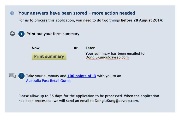
If there are steps must be done offline – for example, if an in-person interview is needed — do not show the completion screen after the last online step. Instead, show a screen like this:

This screen must only ever be shown after the last online step. In other words, this screen comes after any ordering and payment screens. If this is not done, form-fillers get confused and do not follow the necessary process, as confirmed by testing for both Working With Children Check Unit and Births, Deaths and Marriages.
On this screen, note how the:
- general information style is used (see the section on Messages in Layout of forms - key components)
- heading reassures the form-filler that their answers have not been lost, but also indicates the need for further action
- number of steps and due date (if applicable) are included in the introduction, the due date in bold
- steps are numbered in a style more prominent than body text.
- vertical spacing between the steps is sufficient to make them look separate whereas within each step, the spacing between elements is tight enough to make them look related.
- after the last step, there is text explaining what will happen when all the form-filler actions are complete
- the desired course of action (for example, print now) is emphasised by:
- coming before other actions (for example, print later)
- use of the primary action button (see Buttons and navigation in Layout of forms - key components).
Icons have been included but using icons is optional. The icons shown are indicative only, but they do demonstrate the characteristics of usable icons: illustrative, intuitive and uncomplicated.
Printer icon designed by Cengiz Sari and identification icon designed by Guido Haak, both from The Noun Project website, licensed under Creative Commons.
Updated