Follow these 8 steps for designing the process of a new or existing form
As much as possible, make use of these existing options. The best form is no form.
Consult with your internal or external IT provider to implement the online form, following the design forms - digital guide.
- analyse and document the minimum business information need, including which data is required and which is optional
- analyse and document the specific audience(s) from which the information must be collected
- analyse and document relevant business constraints
- analyse and document relevant legal requirements
- when you have the results of the first four steps, ask: 'What’s the best way to collect that information, from those audience(s), meeting the applicable business constraints and legal requirements?'
Options may include:
- existing data sources from within your business unit, department, across government, or from other organisations and/or
- existing online forms
If, after this analysis and consideration of existing options, a new online form is still needed, use this Standard to sketch out an initial draft.
Analyse and document the process around the form:
- how the form will be distributed or accessed
- what will happen after the form is complete
- what systems — for example, user portals, ecommerce solutions and payment gateways — the form needs to interact with, and how
- what alternatives you are going to put in place for form-fillers who cannot or will not use the internet
1 form or many?
In the majority of cases it is best to leave all questions in the 1 form, and use conditional and trigger fields so that each form-filler sees only questions that are applicable to them.
Why 1 form is usually best
Often the business needs:
- information that comes from all members of the target audience
- information that comes from just some members of the target audience
Examples:
|
Form |
Info from all in audience |
Info from just some in audience |
|---|---|---|
| Births, Deaths and Marriages - Register a birth | Number of babies born, whether parents agree on name(s), mother’s identity, whether mother has any previous children | Whether donor treatment was self-insemination (only applies if donor treatment used), marriage details (only applies if married), details of previous children (only applies if mother has previous children) |
| Consumer Affairs Victoria - General complaint | Whether the complaint is regarding a private sale, cost of goods/services, complainant’s identity | Details of other parties involved (only applies if other parties involved), description of goods (only applies if purchase was of goods rather than services) |
| Working With Children Check Unit - Change of details | Residential address, postal address | Organisation details (only applies if organisation known), occupational work codes (only applies if organisation details given) |
Theoretically, each of the above forms could be split into multiple forms, 1 for each special audience. For example, Register a birth could be split into different forms:
- 1 for people using donor treatment
- 1 for married people
- 1 for mother’s with previous children and
- 1 for everyone else
However, splitting forms in this way can lead to problems:
- which form should a person use if they fit into more than 1 category (for example, is a married mother with previous children)?
- there's extra work for form-fillers to figure out which form they should use
- what if a person uses the wrong form?
- work is needed to keep the separate forms consistent (for example, if the 'address' question is changed in the married people form, it has to be separately changed in each of the other forms, without error)
When many forms might be needed
The exception is when there's much more 'information from just some members of the target audience than 'information from all members of the target audience'. For instance, if 5 questions are common to all audience members, but the remaining 20 are audience-specific, then it makes sense to split the form by audience. An example might be a form that's available in three different languages.
If you do split a form by audience, make sure the difference between the forms is:
- clearly described
- at the point where the form-filler will have to choose between the forms
- in the target audience's language
Providing access to the form
An online form may be brilliantly designed and developed, but if form-fillers can’t find it, it’s no use at all! Therefore, how you provide access to the form is as important as the form itself.
|
Include a link to the form… |
Example |
|---|---|
| …on the main informational webpage that the form relates to. | Include a link to Register a birth on the information page about registering a birth. |
| …in form index pages, under the topic and/or relevant letter of the alphabet. | For Consumer Affairs Victoria, include a link to General complaint in the 'Forms and publications' page, ideally in a section labelled 'Complaints'. |
| …in lists of 'key tasks' (if applicable). | For Births, Deaths and Marriages, it makes sense to include Register a birth in 'Top resources'. |
| …on the site home page (if the form is one of the main reasons people visit the site). | For Working With Children Check Unit, it makes sense to include, on the site home page, a link to the Working With Children Check application form. |
| …in relevant emails and SMS. | For Working With Children Check Unit, a reminder SMS about keeping contact details up to date should include a link to the change details form. |
| …on relevant external sites. | For Consumer Affairs Victoria, a link to a real estate agent complaint form might appear on Real Estate Institute of Victoria website. |
Also, form screens should be indexed and appear in search results (Forms layout - key screens has more guidance). Wherever a link to a form is provided, the link text should be exactly the same as the Form title (see Layout of forms for guidance).
Browser-based autocomplete
Browser-based autocomplete is a feature of the web browser where the browser fills out form fields on behalf of the user (using data typed in previously). It saves the form-filler time and effort, but can reduce security. As such, the form autocomplete attribute must have a value of 'off'. This will ensure the browser does not automatically complete entries.
For more information, visit the HTML <form> autocomplete Attribute page on the W3Schools website.
Sign-in and registration
Only use or create a sign-in/user account system when absolutely essential. As the UK Government Service Manual says:
Avoid making users create accounts if you can because they’re:
- a barrier for many users and will reduce completion rates
- difficult to build and maintain
Only use user accounts if your users are likely to need to review or update their data across multiple uses of your service. If a sign-in system must be implemented, make sure it meets relevant security and privacy requirements. Refer to protect privacy - digital guide and secure your service - digital guide.
For a usable system, apply the following principles.
About
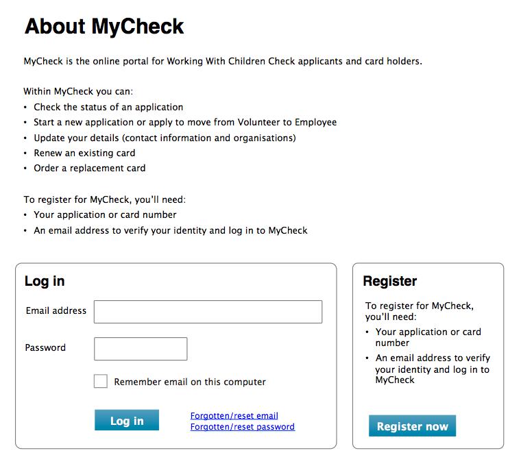
Every sign-in system should have an informational web page explaining:
- who the system is for
- the functions the system offers
- what people will need to register
The page should finish with two calls to action: the first to sign in (the more frequently used function), the second to register. If it has more than two fields, the registration form can be shown on a separate screen.
Example of an 'about' page following the principles above:
Registration
Choosing a username
From most to least ideal, the options for username are:
- email address
- username the form-filler creates
- username allocated to the form-filler
For form-fillers, email address is the easiest and most memorable username. Therefore, email addresses should be used as an identifier whenever possible.
However, be aware that email addresses:
- are often not unique to an individual
- change frequently
- can be tied to an organisation and thus only valid while the person is associated with that organisation
If you can't use email address as an identifier, the two main alternatives are:
- a username invented by the form-filler
- a system-generated username
Neither alternative is particularly usable, as both require the form-filler to remember something that they're likely to use only with your service, and perhaps infrequently.
The form-filler invented username has the benefit of being something meaningful to the form-filler (for example, a combination of given and family name). However, such usernames are often not unique, requiring the form-filler to make several attempts at registration (a very frustrating experience).
System-generated usernames are unlikely to be memorable.
Other registration principles
- include a link to the sign-in form, to facilitate quick switching
- if a verification process is used — for example, confirmation of an emailed link— warn form-fillers of this before they start creating sign-in credentials
- at the point where form-fillers create a username and/or password, spell out the requirements
- keep these requirements as simple as possible. In particular, let the user know whether there are restrictions on length, characters, words or the fields are case sensitive
- because it is cognitively very difficult to process and adhere to, conditional logic should not be used as part of username or password requirements (for example, 'Your password must contain three of the following four elements'). Convoluted password requirements reduce security rather than improve it, because they lead to people writing their passwords down and storing them inappropriately
- allow a wide range of characters in usernames and passwords, including letters of the alphabet, upper and lower case, numerals, punctuation (especially underscores, dashes and hyphens) and spaces
- for passwords, a reasonable minimum can be set on the number of characters (for example, 6)
- do not set a maximum
- do not require the double entry of email address: use a verification process instead
- do not require the double entry of passwords. Instead, provide a simple password reset function
- passwords should be able to be pasted into the password field (for example, from a password manager)
- do not use a password strength meter. Password strength meters are hard to do well, requiring weekly or more frequent updating against best practice
- if a form is very closely linked to registration for a system, incorporate the registration into the form rather than having it as a separate task
Example of a registration form following the principles above:
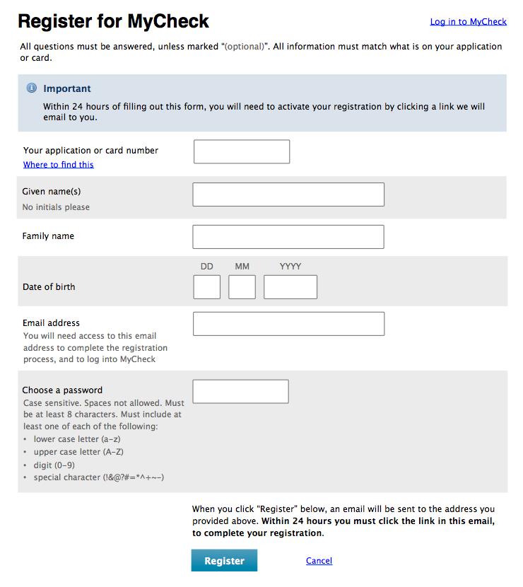
After submitting the completed form — and correcting any validation errors — the form-filler should be presented with a screen like this:
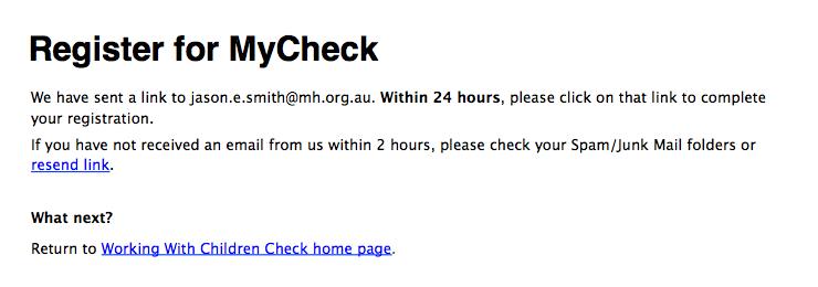
Note how form-fillers are given the ability to resend the email link once. This function helps with email services that use grey or white listing. Providing it only once minimises illegitimate bot use. This is the message that shows after re-sending:

Sign-in
- make sure a sign-in function is available whenever users might need it (for example, always shown in the top right hand corner of informational web pages)
- on the sign-in form, include a link to registration, to facilitate quick switching
- if the username is an email address or other existing identifier, tell form-fillers. If the username can be found on documentation — for example, a Working With Children Check Card — tell form-fillers this also
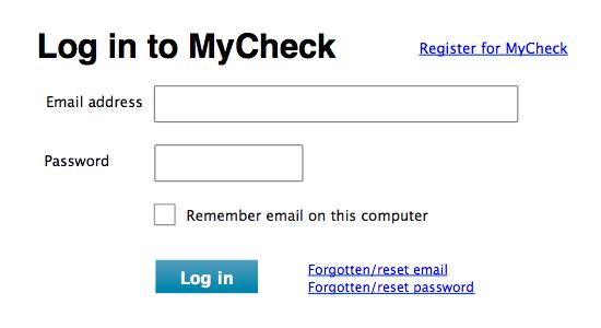
- if possible, give the form-filler the option to have the username remembered. Refer to this option as 'Remember username on this computer' rather than just 'Remember me'. Position this option after the password field so that the ‘pairing’ of the email address and password fields is not interrupted
- include links to 'Forgotten/reset username' and 'Forgotten/reset password'. These are located to the right of the 'Sign in' button, for consistency with other sign in designs on the web
- if sign in succeeds, load the welcome page of the system the form-filler has signed in to, unless signing in was a step in a wider form-filling process
- if sign in fails:
- tell the form-filler that 'The username / password combination you entered is not correct. Please try again.'
- allow at least five attempts before doing anything: typos are easy to make
- with the fifth attempt, start implementing penalty periods (for example, do not allow another sign in attempt for an hour, then two hours, then four hours, and so on)
- always provide a telephone number that form-fillers can call to get help with signing in
- once signed in:
- a sign out button or link should be provided prominently in the top right corner
- the option to sign out can also be provided via navigation, if sensible
- a form-filler should never be presented with a 'sign in' (or register) option
- the session should follow the rules for Time limits, with time countdown beginning from when the form-filler signed in
Example of a sign-in form following the principles above:
Forgotten/reset details
Provide options for users to retrieve forgotten details such as the account identifier and password.
Self-reset of details can be provided where the:
- account does not allow access to security-classified information and
- information required was also used to register the account
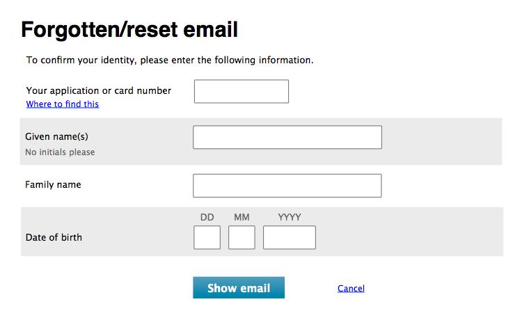
Forgotten/reset email
Immediately after clicking 'Forgotten/reset email':
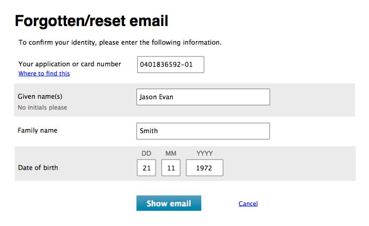
Form-filler enters their information:
Form-filler clicks 'Show email':
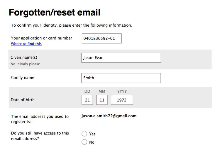
Case 1 – Form-filler still has access to registered email address:
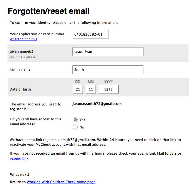
As per the registration process, the form-filler is able to resend the email link once.
Case 2 – Form-filler no longer has access to registered email address:
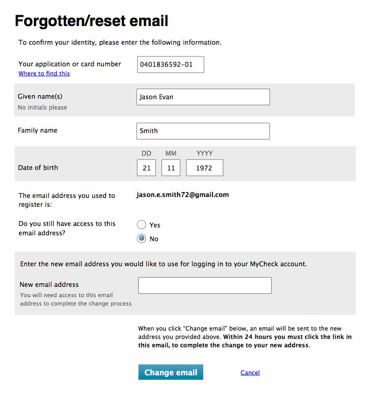
Form-filler provides a new email address:
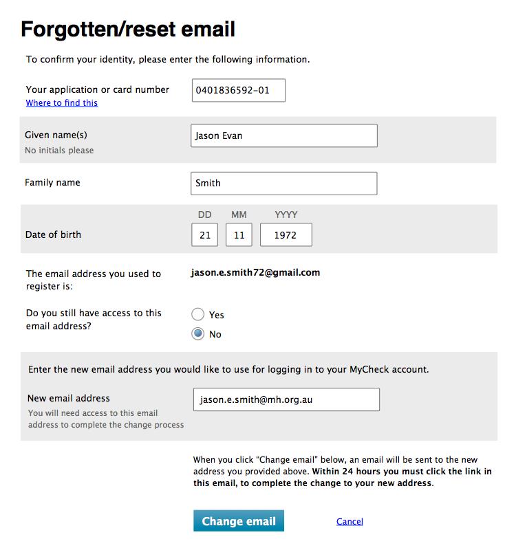
Form-filler clicks 'Change email':
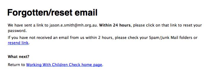
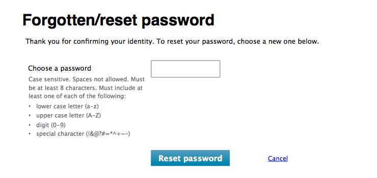
Forgotten/reset password
Immediately after clicking 'Forgotten/reset password':

After entering an email address and clicking 'Send link':
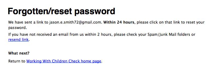
As per the registration process, the form-filler is able to resend the email link once. The form-filler follows the link that was emailed to them:
For both registration and sign-in
- it should be simple to change to signing in from a registration screen, and vice versa (for example, via a link)
- for form-fillers using mobile or tablet devices, use relevant keyboard types (for example, email for usernames that are email addresses)
- never have a 'clear' or 'reset' button on a registration or sign-in form
- only ever use:
- the verbs 'register', 'sign in' and 'sign out' (when you’re referring to the action)
- the nouns 'registration' and 'sign-in' (when you’re referring to the name of the system)
- never use CAPTCHAS. By their very nature CAPTCHAS are inaccessible to many user groups (screen reader users, people low vision and deaf users). Furthermore, CAPTCHAS can pose huge usability issues, in particular with old and infrequent web users
Save and resume
'Save and resume' refers to the ability to save a draft form for completion at a later date.
Save and resume functionality should be provided when a form:
- has more than two steps and/or
- requires information that is not top-of-mind (for example, has to be gathered from documents or another person)
When save and resume is provided, the save function should be positioned thus:

'Save for later' is a link because it is a less desirable action than 'Next' or 'Back'.
Using the 'Save for later' link should trigger whatever is necessary to action the request:
- if the form-filler is signed in, use their account credentials to save the draft — do not require the entry of a new email address
- if the form-filler is not signed in, ask for an email address to which a unique URL can be sent, allowing the retrieval of the form. To make saving quick and easy, avoid the need for account registration (that is the entering of a password) where possible
Saving should be confirmed, and the confirmation should include a link to a relevant informational web page (that is take the form-filler out of the form):
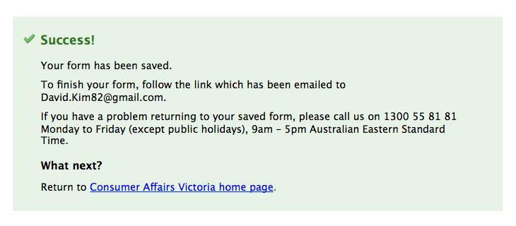
Access to resume a form should be provided in the same locations as starting a new form (see the earlier section on this page on Providing access).
Time limits
Avoid implementing time limits. Form filling can be stressful and lengthy, especially if a person has a disability or is using assistive technology.
If a transaction must be time limited:
- time should count down from each server page load, rather than the start of the form as a whole
- the time limit should be no less than 20 minutes.
- the form-filler should be warned when three-quarters of the initial time limit has passed and when there's only a minute remaining
- extensions to the time should be for the same amount as the initial limit. For example, if the initial limit was 20 minutes, the extension should be for 20 minutes
- form-fillers should be given the option to extend up to 10 times
- do not show a countdown timer on the form: timers create pressure for form-fillers
Implement time limit warnings as follows:
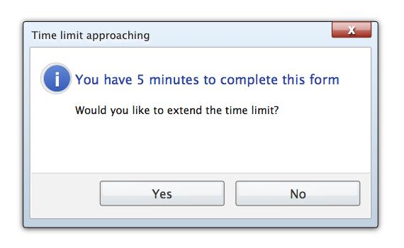
The 'Yes' button extends the time limit by 10 times the initial amount. The 'No' button has no impact on the time limit. Both buttons should return the form-filler to the form.
If the form-filler does not respond to a time limit warning before the time limit is reached — for example, because they walked away from their computer — the session can be timed out. The Introduction page for the form should then be loaded (Forms layout - key screens has more guidance).
For information on how to implement this accessibly, visit the Enough time page on the W3C website.
Confirmation emails
'Confirmation emails' refers to the email sent to form-fillers after they submit the form, which confirms a successful submission.
A confirmation email should be sent for every form; a complementary SMS can also be sent if there's a need. Do not send only an SMS, as this precludes providing a full copy of the submission.
The content of confirmation emails should mirror that of the Completion screen (Forms layout - key screens has more guidance). In particular, the email should:
- have a subject line of 'We have received your completed <form title> form' in the body text, confirm that the submission has been successful
- if the submission is provided in the body of the email or as attachment. Only include a summary and exclude any personal, sensitive, or security classified information, format to suit reading, scanning and printing and explain what will happen next
- provide contact details for any enquiries about the submission
- very prominently display the reference number (if any) for the submission, and explain that this number should be quoted when enquiring
Updated