Primary logo
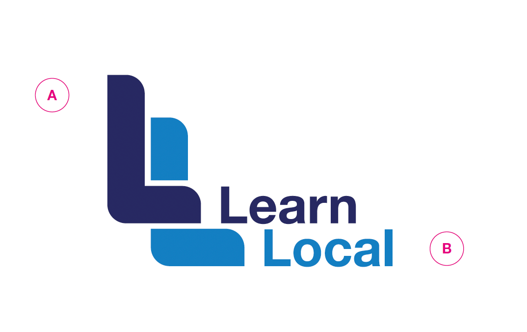
The Learn Local logo is made up of two components, the ‘LL’ symbol and ‘Learn Local’ wordmark.
A. Symbol
B. Wordmark
Visual consistency
To maintain visual consistency, the logo components and their relationship to each other must not be changed in any way.
The symbol must be used in conjunction with the wordmark and cannot, at any time, be separated or used by itself.
Where you are restricted by colour versioning or background colour, please see ‘Secondary logo’.
Clear space
Please provide our logo a minimum amount of clear space to ensure recognition and impact. The minimum clear space is determined by using the height of the ‘L’ from our wordmark.
Do not allow any distracting graphic elements such as copy, photography or background patterns to interrupt the clear space. This applies to all versions of the logo.
Print minimum size
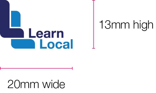
In print production, the Learn Local primary logo should not be reduced to a size smaller than 20mm wide and 13mm high. This rule applies to all versions of the logo.
Digital minimum size
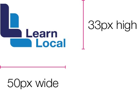
In digital production, the Learn Local primary logo should not be reduced to a size smaller than 50px wide and 33px high on any digital application.
When to use different logos
In addition the Primary logo, there are a number of other versions that you can use depending on the size, layout and contents of your promotion. Here is some information about these logo versions and when to use them.
Logo
Use if the Learn Local URL is included in the body copy.
Logo with URL
Use if Learn Local is mentioned in the body copy, but no URL is listed.
Logo with tagline
This is the preferred logo for promotion and awareness. Use when space in the layout allows.
Co-branding
Use when pairing your organisation logo with Learn Local as a co-brand.
Learn Local alliance
Use when a number of regionally located registered Learn Local providers align themselves.
Note: Specific applications of each will depend largely on what you are producing and your specific layout. Examples in the applications section of this guide provide examples on how you might use the Learn Local logo in conjunction with your organisation’s logo and existing documents.
In instances where production restraints are limited to black and white, please refer to secondary logos at the bottom of this page for black and white logos.
Secondary logos
The following logo options are available where production restraints are limited to black and white.
Mono
Mono reverse
The mono reverse versions of the logo are provided to use on top of primary colours or on photography with clear minimal space, avoid placing on a busy background.
This applies to all versions of the logo.
Mono with tagline
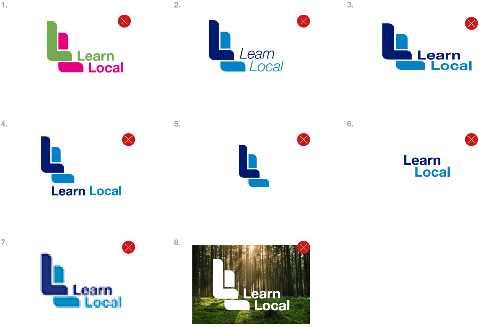
Logo misuse
Our logo is our signature. By using it consistently and in accordance with these guidelines, we can ensure that we are recognised whenever and wherever it appears.
Updated
