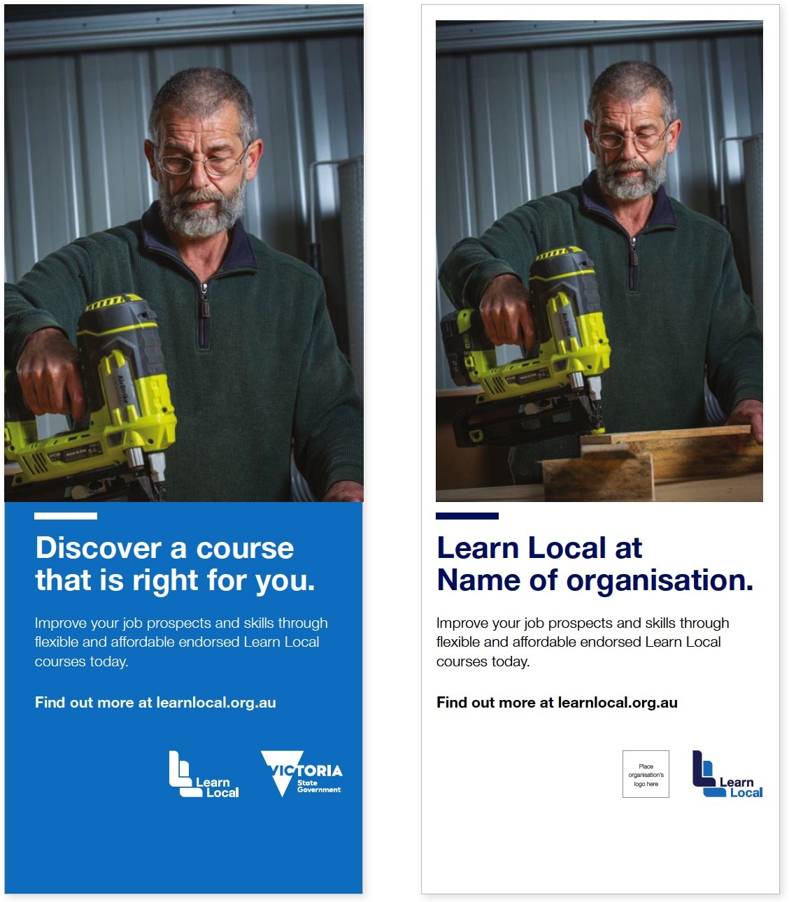
- Date:
- 6 Dec 2021
Learn Local is about people empowering people
Victoria’s Learn Local sector comprises more than 240 community owned and managed not-for-profit organisations – known as Learn Local providers.
What is Learn Local
The Learn Local sector is an essential part of Victoria’s post-secondary education and training system. It plays a vital role in providing pathways for adult learners to transition to employment and further training.
The Victorian Government, through the Adult, Community and Further Education (ACFE) Board, registers and funds these organisations so people can study and work in their local area.
Adults who want to develop their core skills for study, work or life can enrol in Learn Local courses throughout the year. These short courses are offered at low or no cost to eligible Victorians, range from literacy and numeracy to job related and digital skills and are delivered by experienced and dedicated trainers.
The Learn Local brand
Our brand reflects who we are, our aspirations and our values
Using the Learn Local brand consistently increases awareness and understanding of the value and breadth of our courses and programs. This will lead to more participation in Learn Local courses over time.
The Learn Local logo
The Learn Local Logo tells potential learners and employers:
- your organisation currently offers government-subsidised Learn Local courses
- your Learn Local courses assist people to develop core skills for study, work and life (core skills includes literacy, numeracy, English language, employability and digital skills)
- your Learn Local courses are offered at low or no cost to eligible Victorians
- your Learn Local courses are designed and monitored against a quality framework
- your Learn Local courses offer pathways to further study and/or work opportunities.
The promise
The Learn Local sector believes every adult should have local access to the training and services they require to build their education capacity and develop the core skills they need for study, work and life.
Our offer
The Learn Local sector offers local, inclusive, flexible and government-subsidised training, programs and projects that help Victorian adults build their education capacity and develop the core skills they need for study, work and life.
How to use these guidelines
These guidelines contain the tools and information you need to use the Learn Local brand.
The brand will help learners and employers find Learn Local courses that are funded and endorsed by the ACFE Board. It will help your organisation to promote your Learn Local courses and projects with credibility.
The Learn Local logo should not be used as a replacement for your organisation’s logo. It should support, promote and endorse the Learn Local courses and projects that you deliver.
Fonts and colours have been selected to be clear and accessible. The design toolkit section outlines the correct usage of these.
In the copy toolkit, you’ll find key messages to get you started with promotional activities and community engagements.
Be sure to take the time to look at the applications and templates section – these items are freely available to download and provide examples and inspiration to use the brand effectively.
These applications and templates have been provided for optional use by registered Learn Local providers that are currently funded to deliver Learn Local courses.
Learn more about ACFE Board funding acknowledgement requirements.
Logo usage
The Learn Local logo is our most prominent visual feature, let’s make sure we use it correctly for the biggest impact.
Primary logo
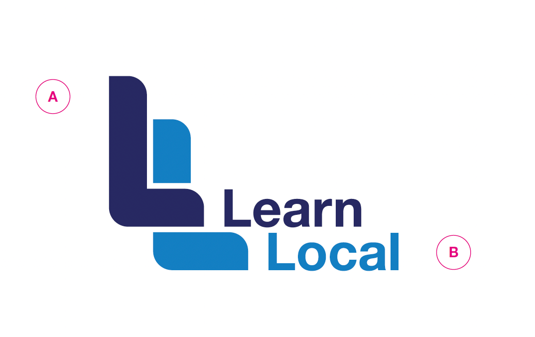
The Learn Local logo is made up of two components, the ‘LL’ symbol and ‘Learn Local’ wordmark.
A. Symbol
B. Wordmark
Visual consistency
To maintain visual consistency, the logo components and their relationship to each other must not be changed in any way.
The symbol must be used in conjunction with the wordmark and cannot, at any time, be separated or used by itself.
Where you are restricted by colour versioning or background colour, please see ‘Secondary logo’.
Clear space
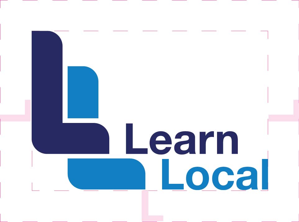
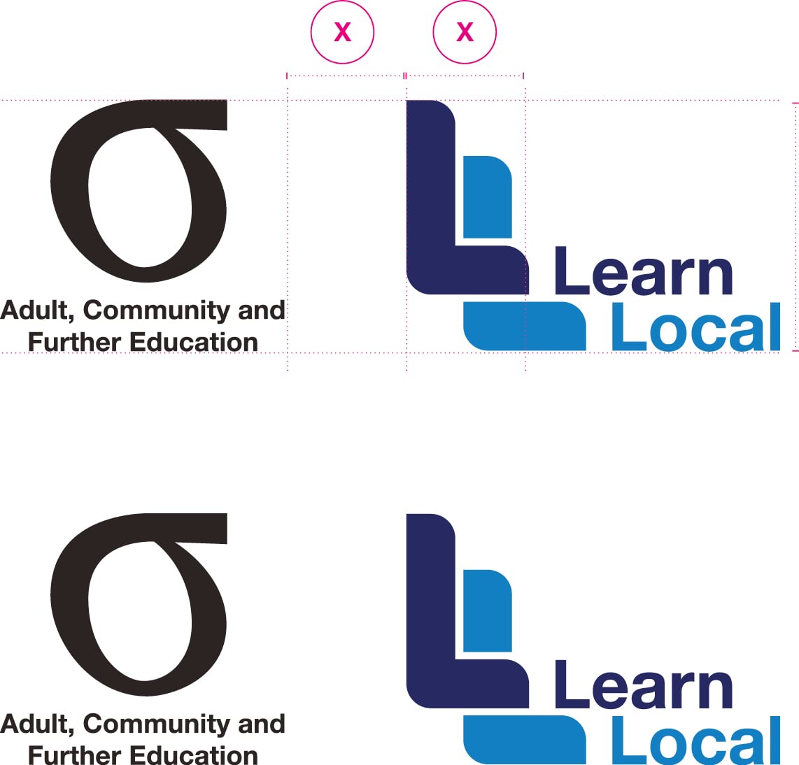
Please provide our logo a minimum amount of clear space to ensure recognition and impact. The minimum clear space is determined by using the height of the ‘L’ from our wordmark.
Do not allow any distracting graphic elements such as copy, photography or background patterns to interrupt the clear space. This applies to all versions of the logo.
Print minimum size
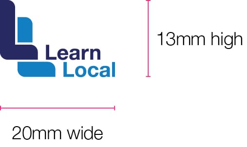
In print production, the Learn Local primary logo should not be reduced to a size smaller than 20mm wide and 13mm high. This rule applies to all versions of the logo.
Digital minimum size
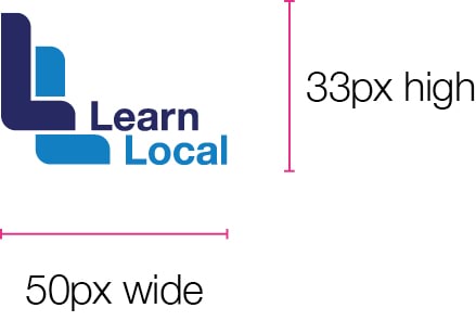
In digital production, the Learn Local primary logo should not be reduced to a size smaller than 50px wide and 33px high on any digital application.
When to use different logos
In addition the Primary logo, there are a number of other versions that you can use depending on the size, layout and contents of your promotion. Here is some information about these logo versions and when to use them.
Logo
Use if the Learn Local URL is included in the body copy.
Logo with URL
Use if Learn Local is mentioned in the body copy, but no URL is listed.
Logo with tagline
This is the preferred logo for promotion and awareness. Use when space in the layout allows.

Co-branding
Use when pairing your organisation logo with Learn Local as a co-brand.

Learn Local alliance
Use when a number of regionally located registered Learn Local providers align themselves.
Note: Specific applications of each will depend largely on what you are producing and your specific layout. Examples in the applications section of this guide provide examples on how you might use the Learn Local logo in conjunction with your organisation’s logo and existing documents.
In instances where production restraints are limited to black and white, please refer to secondary logos at the bottom of this page for black and white logos.
Secondary logos
The following logo options are available where production restraints are limited to black and white.
Mono
Mono reverse
The mono reverse versions of the logo are provided to use on top of primary colours or on photography with clear minimal space, avoid placing on a busy background.
This applies to all versions of the logo.
Mono with tagline

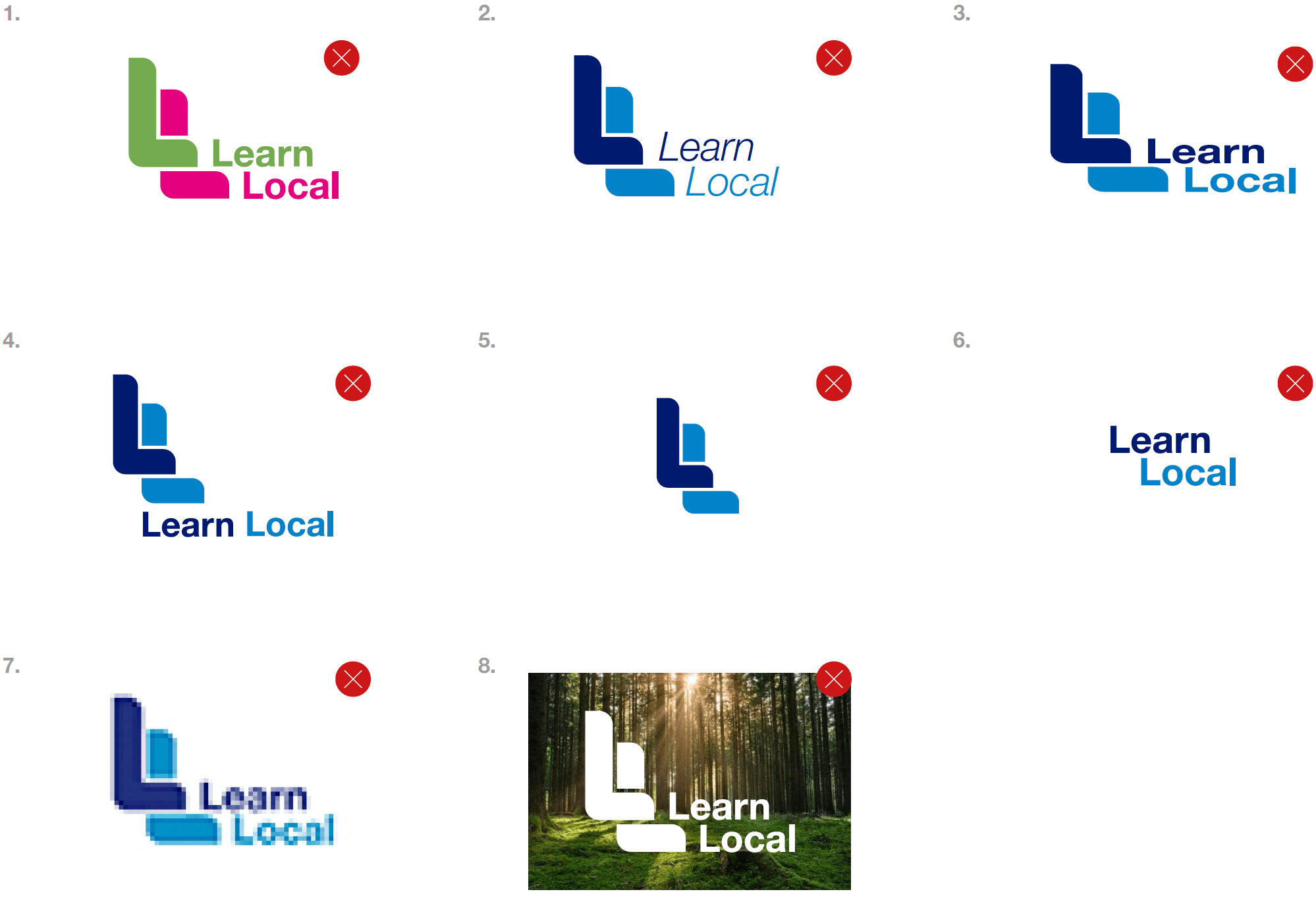
Logo misuse
Our logo is our signature. By using it consistently and in accordance with these guidelines, we can ensure that we are recognised whenever and wherever it appears.
Design toolkit
Let’s ensure we look our best when we’re engaging with our community.
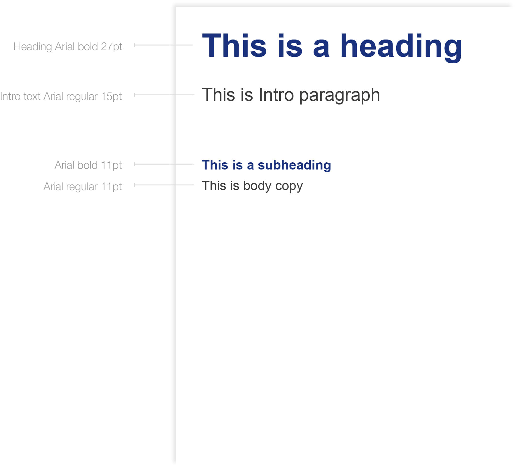
Brand fonts
Primary font – Arial
Arial is the preferred font for use in all marketing and advertising applications.
Arial Regular should be used for body paragraphs, while headings should be in Arial Bold.
Design professionals
In cases where you have access to professional design software, Helvetica Neue is the preferred font.
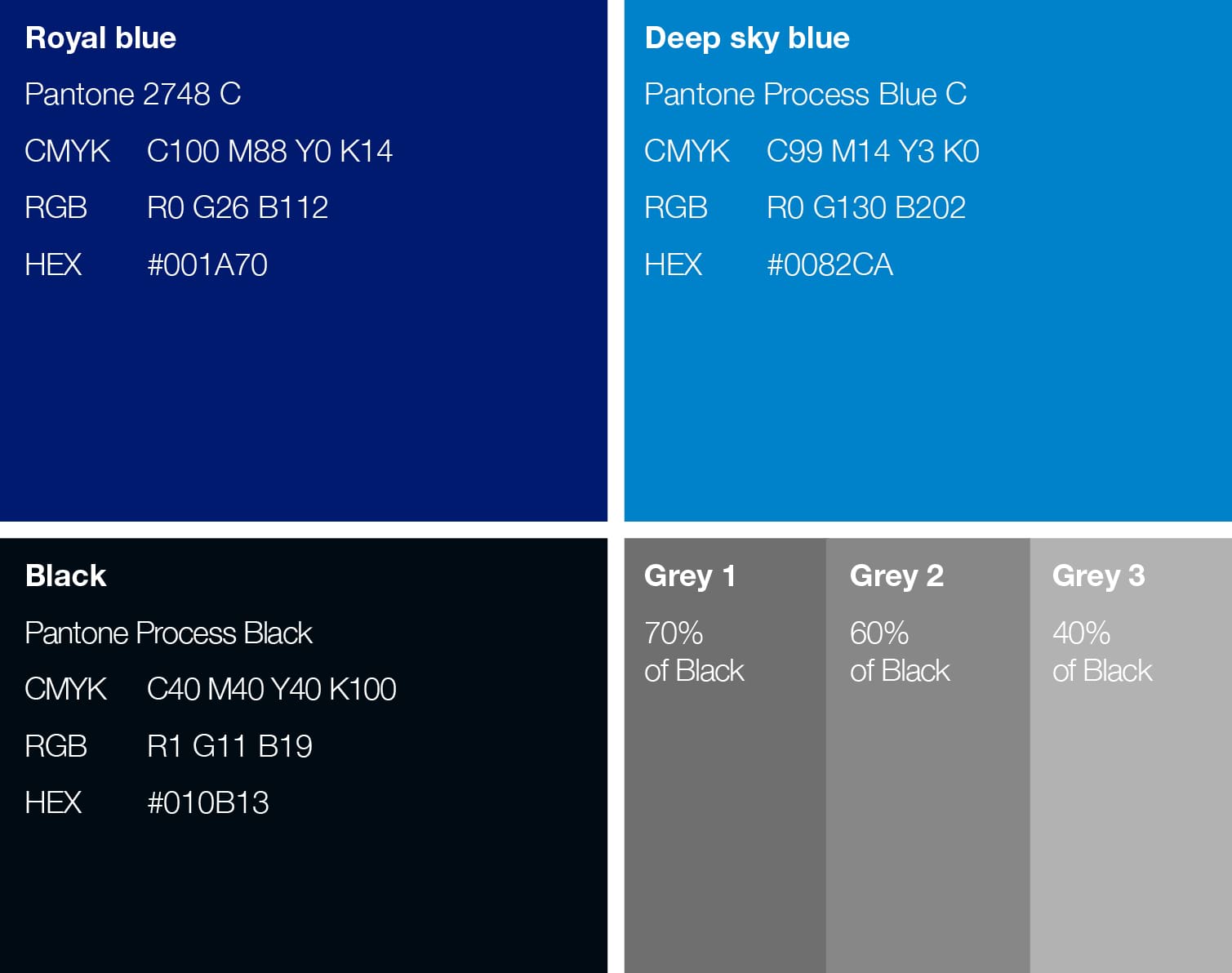
Primary brand colours
Our brand colours have been selected from the Pantone Matching System (PMS) to help in ensuring accurate reproduction across a broad range of media. The colour codes to the right translate these colours for use in application.
Pantone: The Pantone colour matching system ensures the most accurate reproduction of colour in print.
CMYK: When Pantone colours are not available for printing, the CMYK values shown should be used as a guide.
RGB: All screen media (TV, video, internet, mobile and PowerPoint®) should use the RGB values shown.
HEX: The colour references preceded by the # symbol are for use on the web and in html applications.
Note: This guide indicates approximate colour only. For accurate colour matching use the appropriate Pantone PMS guide.
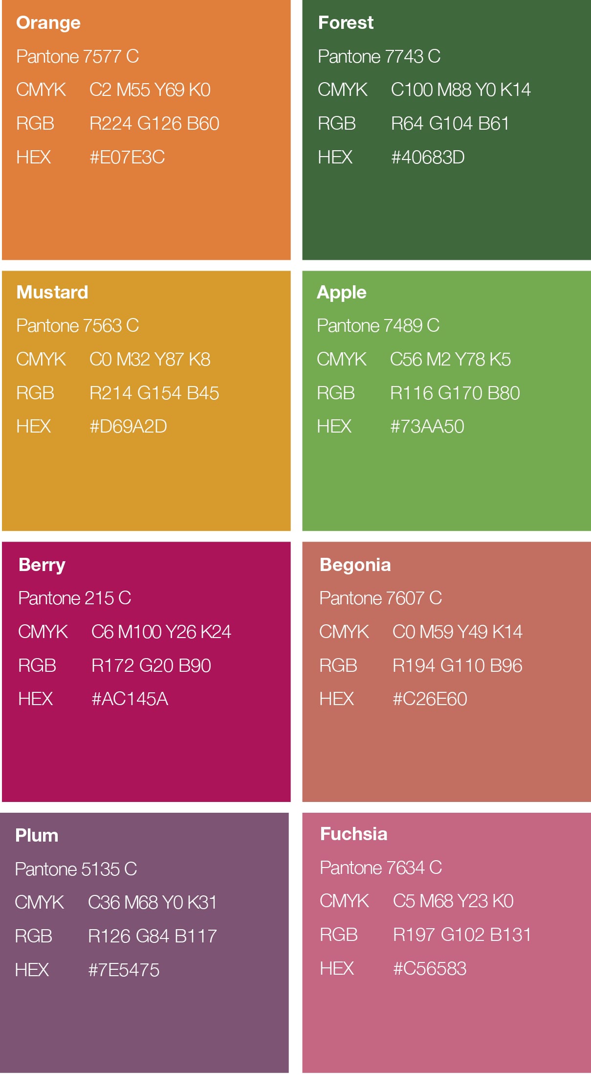
Secondary brand colours
A secondary palette has been created to complement the primary palette. It can be used to extend the primary brand colours for both online and print.
Secondary colours can be used to highlight information, or create added visual excitement. These colours should be used sparingly and only one or two additional colours should be added at a time.
Photography
When choosing photography, please make every effort to consider the following tips:
- a clear subject, sharp and in focus
- as high resolution as possible
- imagery should be friendly, inviting and employ natural light
- display a feeling of real life and real learning moments
- it should not be too posed. Try to reflect the diversity in your organisation and the learners you serve as this will help to keep your imagery feeling honest and real life.
The images below can be used as a reference to give you an idea of what type of imagery will work well in the templates that follow.
Images of learning moments are ideal, but profile images of single learners can also be used to good effect.
Ensure you obtain formal permission from the people featured in the image, and make sure they are made aware of how the image will be used.
Brand icons
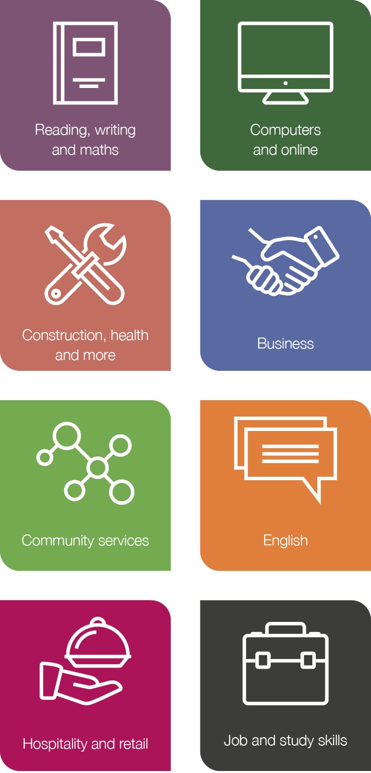
A set of icons has been created to help communicate the broad course offerings available through the Learn Local sector.
The style is clean and uncluttered for ease of application and recognition.
Icons can be used as primary line work, or as coloured ‘seed’ shaped box.
Icons can be used as a set to communicate the full Learn Local offering, or you can use individual icons by themselves to communicate a particular part of the Learn Local offering.
For example, if you are promoting a Learn Local English language course, you may like to add the English icon to the promotional flier/advert/social media tile etc.
Copy toolkit
When you speak about the Learn Local brand, it is important to do so in a clear and consistent manner.
Talking to our community
Our tone of voice reflects our brand personality and your role as registered Learn Local providers. Communications should be clear, to the point and reflect a confident, respectful, intelligent, friendly and approachable character.
What’s our personality?
Committed, approachable, trusted, pathways focused, valued, credible, practical, supportive, helpful and familiar.
We are not:
Arrogant, snobby, condescending, patronising or pushy.
Tone of voice
When a learner comes through your door, it’s likely they are familiar with and trust your organisation’s brand, due to your standing in their local community. Because of this, your brand’s tone of voice is likely to speak with more of an emotive or softer tone. Learn Local in contrast speaks with a tone of voice that is outcomes focused.
When talking about a Learn Local course, we try to speak with the following tones to show authenticity and to draw a larger pool of learners to both your organisation and the Learn Local sector.
Clear
Our audience relies on us for support and information – everything we communicate should provide value and clarity. Avoid euphemisms, clichés, vague quantifiers, repetition, unnecessary detail, heavy punctuation and complicated constructions.
Think through what you want to say, plan a structure, then say it as simply as possible.
Accessible
Avoid jargon or explain it when you must use it. Use familiar, everyday words that learners will understand. We are approachable and speak with a positive, conversational tone. We are down-to-earth, but without being casual – we maintain a professional undertone.
Natural
Trust, integrity and transparency are key to building relationships in our community. Avoid pomposity. Write for an individual, not an audience; many may read a text, but they usually do so separately. Consider how your writing would sound if you read it aloud to a colleague.
Active and simple
Use the active rather than the passive voice. Let’s inspire our audience with positive and imaginative language. Cut out anything superfluous. Split text into small sections, using short words, sentences and paragraphs, and bullets and numbered points.
Who do we speak to and how do we do it?
One of our challenges is that we mean many different things to many different people.
Let’s start by looking at some of the audiences the Learn Local sector interacts with and then we can explore how we might tailor our communications to each to ensure clarity and consistency.
The key messages in this section can be used to help communicate the value of endorsed Learn Local courses and projects.
This has been created to support your existing messaging – we recognise that you understand how best to talk to your community and we encourage you to continue building this rapport by using the messaging that you have tried and tested.
Funding acknowledgement requirements
ACFE Board funding acknowledgement requirements
As part of your ACFE Board service agreement/contract, all currently funded Learn Local providers are required to acknowledge the ACFE Board’s support of your endorsed Learn Local courses and projects on relevant communications.
In particular, it is expected that you use the Learn Local logo on the following types of communications that promote your endorsed Learn Local courses and projects (where space allows):
- brochures/fliers
- websites
- adverts (offline and online)
- social media
- reports and other relevant documents.
The Learn Local logo should not be used as a replacement for your organisation’s logo. It should support, promote and endorse the Learn Local courses and projects that you deliver and therefore in most instances you should lead with your organisation’s brand/logo and the Learn Local logo should be placed in a less prominent position.
Where space doesn’t allow you to use the Learn Local logo on a communication, you can add the text: Endorsed Learn Local course/project (learnlocal.org.au) in an appropriate place.
Victorian Government funding acknowledgement requirements
As part of your service agreement/contract, you may also be required to acknowledge the funding support of the Victorian Government.
Learn Local providers should refer to their contract/service agreement to identify any specific contractual requirements you may have when using the Victoria State Government logo.
Further guidance on acknowledging funding support is available on the DFFH Funded Agency Channel.
Application examples and templates
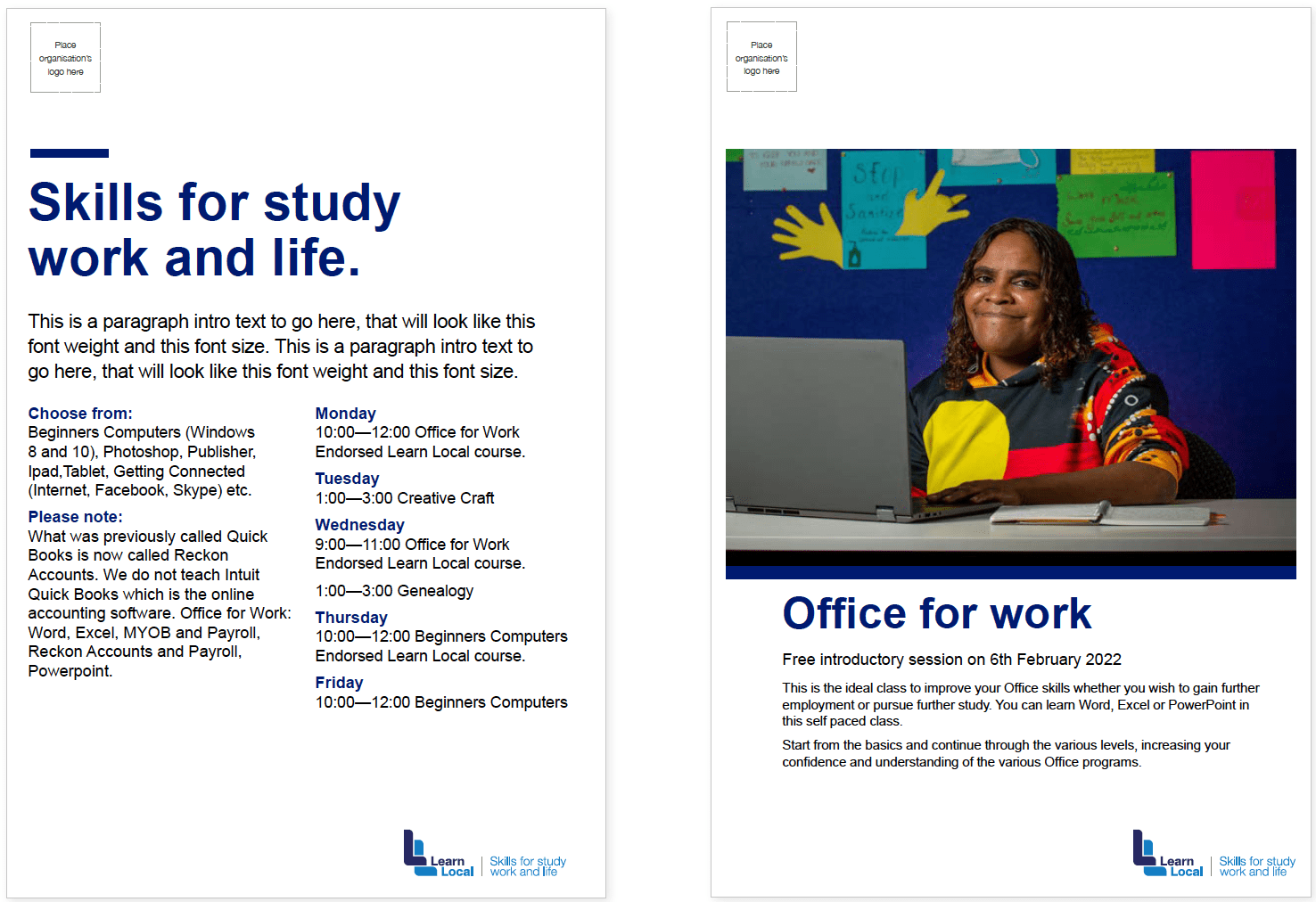
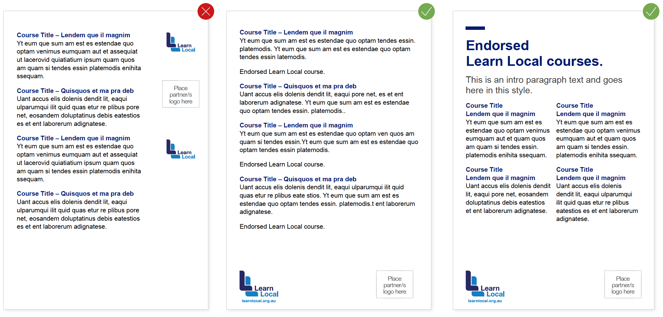
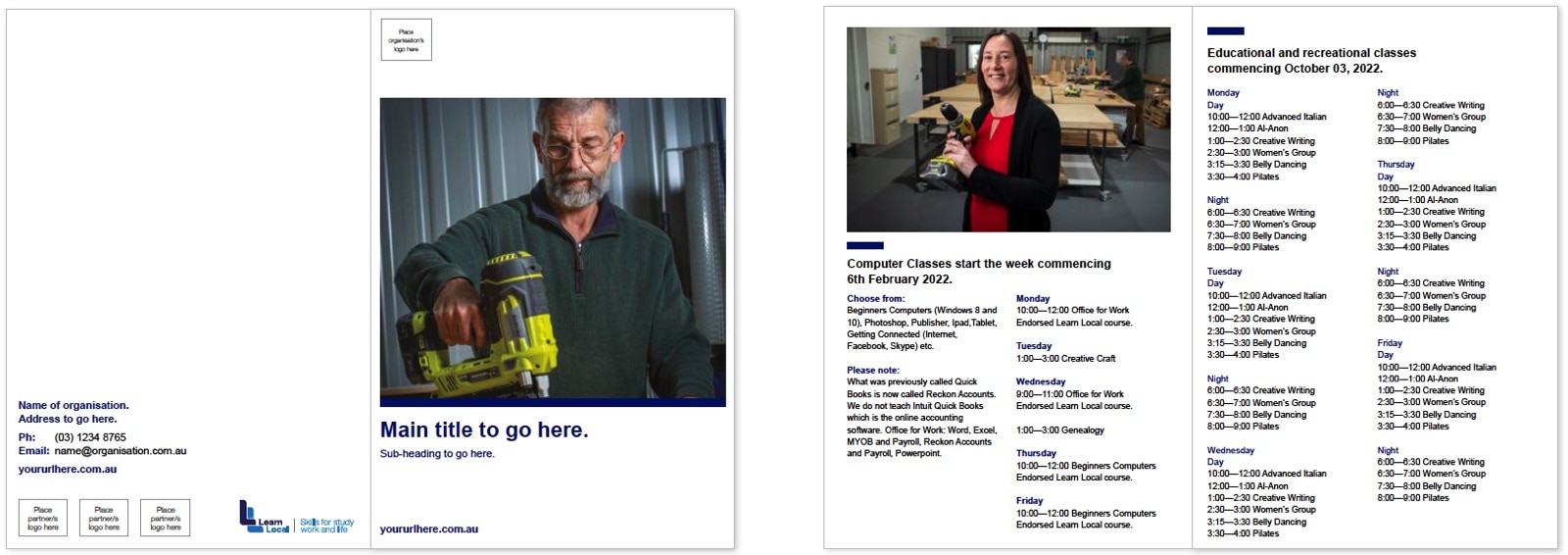
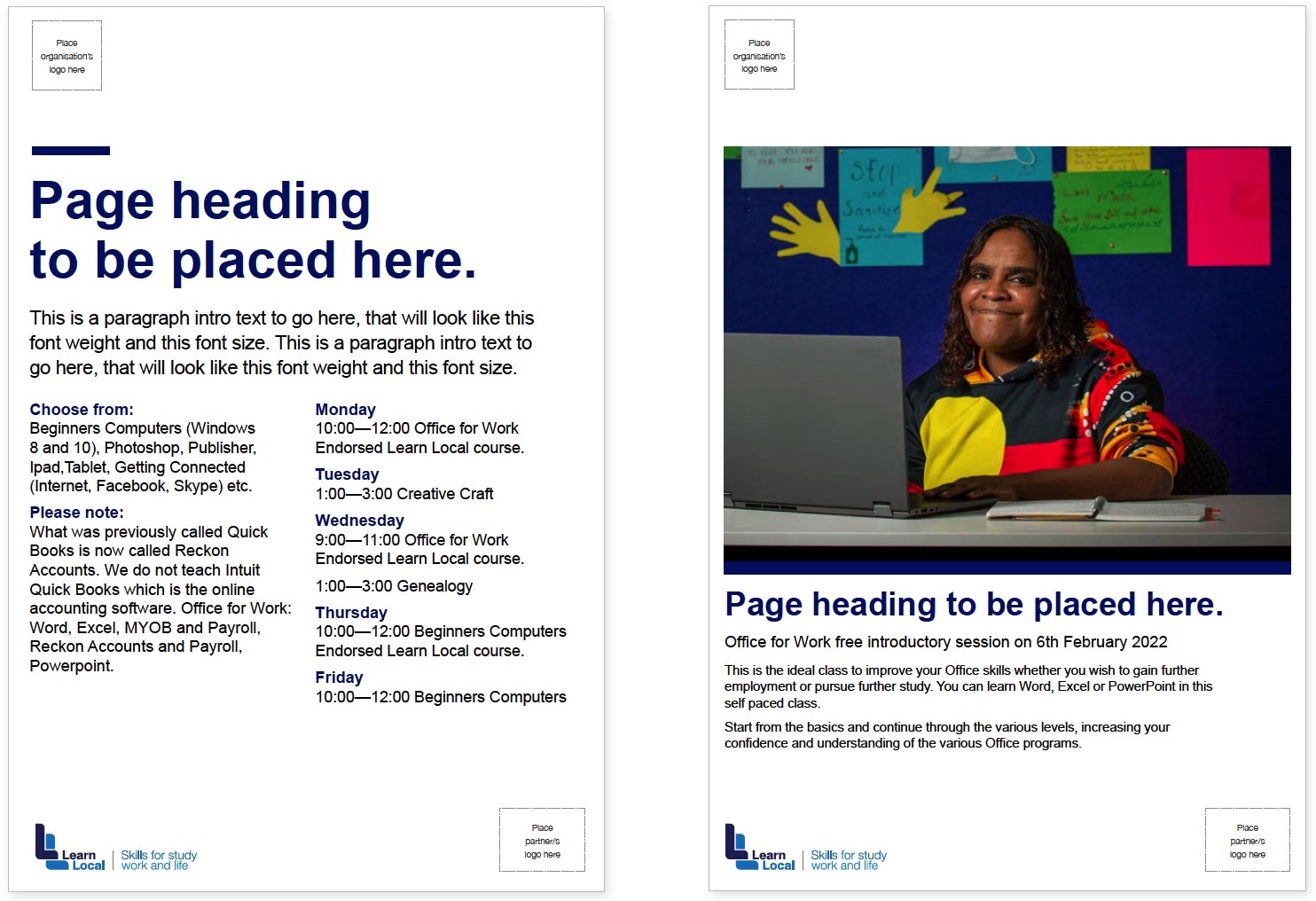
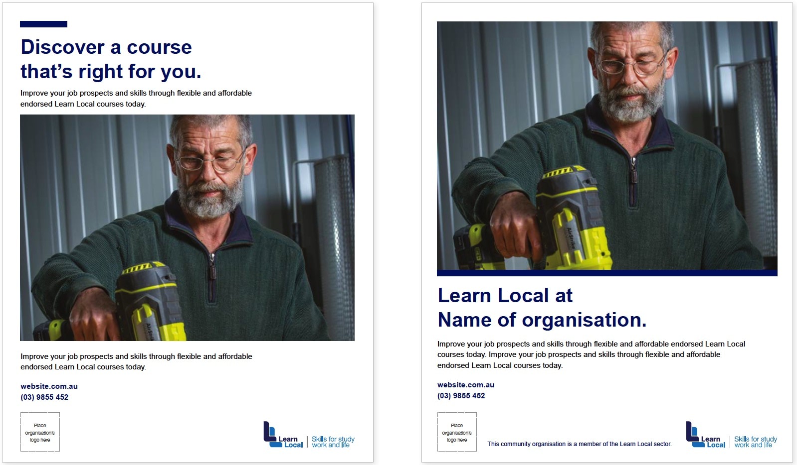
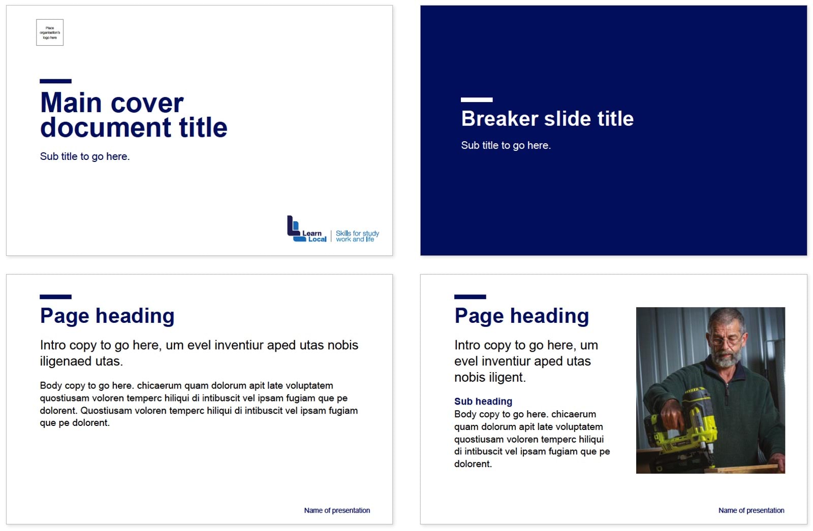
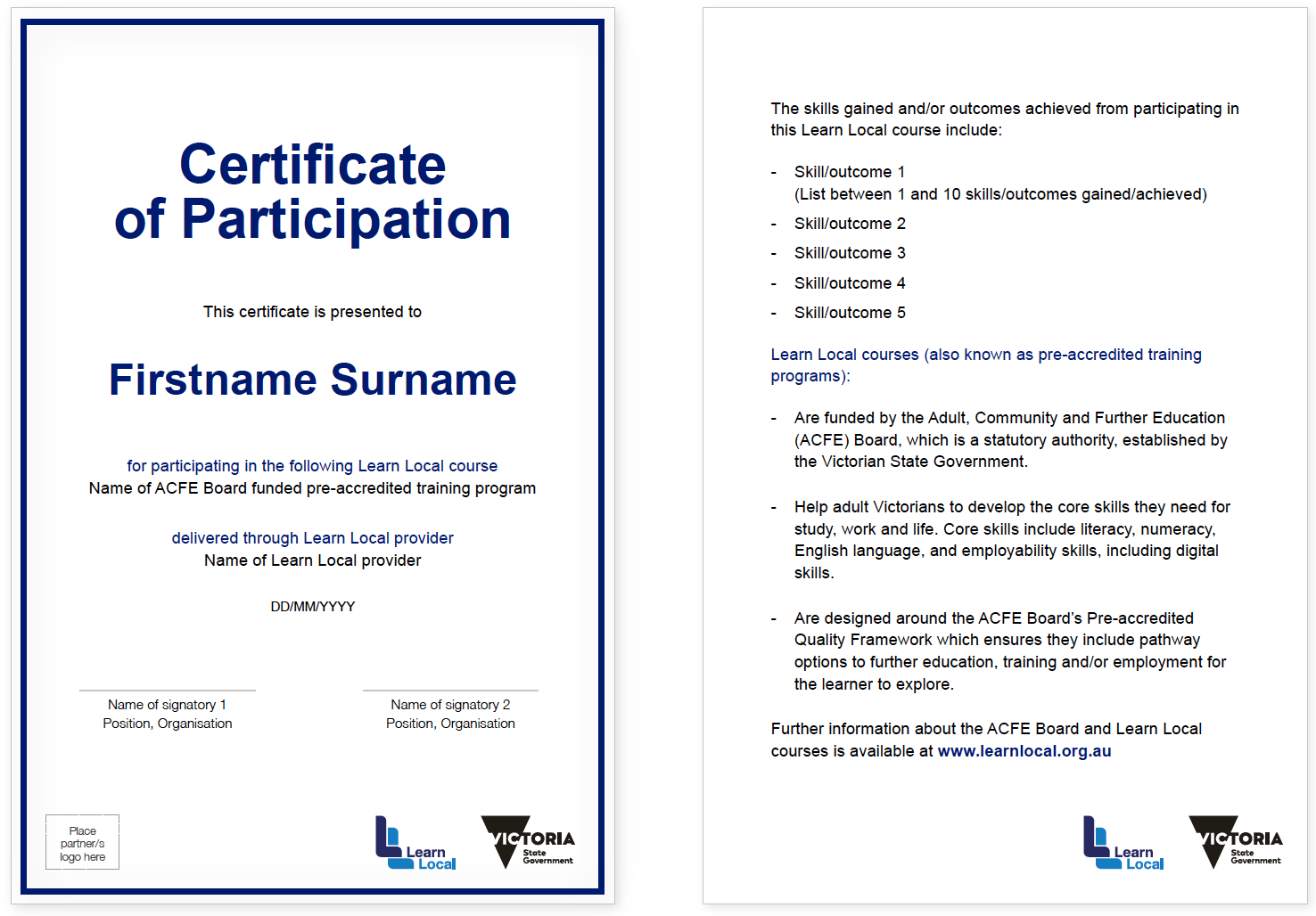
The following examples are provided as an easy starting point for you to develop communications to promote your endorsed Learn Local courses and projects.
Application examples
Templates
How the Government refers to Learn Local
The Victorian Government also promote the Learn Local sector to key stakeholders to increase their awareness and understanding of the sector’s value and impact.
Providers are not alone in the Learn Local brand journey.
The Victorian Government (via the ACFE Board, ACFE Regional Councils and the Department of Education and Training) also promote the Learn Local sector to key stakeholders to increase their awareness and understanding of the sector’s value and impact.
By working together, both Learn Local providers and the Victorian Government can improve the awareness of and participation in Learn Local courses and ultimately help thousands of adult Victorians to develop the skills they need for study, work and life.
Government co-brand
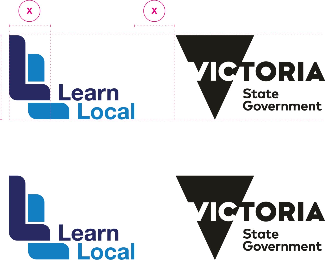
This lockup should only be used by the ACFE Board and ACFE Regional Councils or other Government departments when Learn Local’s relationship with the State Government needs to be communicated.
Providers should refer to their contract to identify the specific contractual requirements for when using the Victoria State Government logo.
Further information can be found in the Acknowledgement and publicity guidelines for Victorian Government funding support.
The Learn Local brand and the ACFE Board brand relationship
The Learn Local brand
The Learn Local brand is the brand used to promote the Learn Local sector and Learn Local courses. The Learn Local brand is mainly used by Learn Local providers (as an endorsement brand of their currently funded Learn Local courses); however the ACFE Board, ACFE Regional Councils and Department of Education and Training also use it to promote the sector on state-wide or targeted external communication/promotional activities.
For example, the ACFE Board would use the Learn Local brand on a brochure aimed at business/industry about the benefits of a partnership with a Learn Local provider or a state-wide promotional campaign aimed at increasing the awareness of the Learn Local sector.
The ACFE Board brand
The ACFE Board brand should not be used on external documents, publications or promotions that are developed in order to increase awareness of the Learn Local sector or Learn Local courses (instead, use the Learn Local brand), nor should it be used by Learn Local providers to promote their Learn Local courses.
The ACFE Board brand may be used in some instances on state-wide external communication and promotional activities for the Learn Local sector where there is a need to further explain the funding relationship between the ACFE Board and the Learn Local sector.
If there is a need to refer to the ACFE Board in a Learn Local context, then you should never replace the term Learn Local with ACFE.
For example, we should never refer to the ‘ACFE sector’ or ‘ACFE providers’. Instead, it would be better to say ‘the Learn Local sector, funded by the ACFE Board’ or ‘Learn Local providers, funded by the ACFE Board’.
ACFE co-brand
When Learn Local needs to be associated with the ACFE Board, the ACFE Co-brand lockup should be used.
This logo should only be used by the ACFE Board and ACFE Regional Councils or other Government departments when there is a requirement to communicate the unique relationship between Learn Local and the ACFE Board.

