Basic text
The basic text component is for inserting body content. This gives you the WYSIWIG (what you see is what you get) window, where you can:
- format headings, paragraphs, lists, quotes and callouts
- add links and buttons
- insert images and other media.
Read our guides on using the basic text component on the Digital Victoria Help Centre.
See how things look on a live website on our Sample page: Basic text component formatting options.
Accordion (standard)
Numbered accordion
Cards
There are several card options that can be used for different purposes.
Promotion cards
Promotion cards are portrait-style (vertical) cards to link to other pages. They're often used on homepages and landing pages to display the site's main sections or subpages but can also link to external websites.
The first example has a thumbnail image and the second has a profile image. They can also be used with no image.
A 'no image' promo card
This card has display style set in the CMS to 'No image' which on Ripple is called 'Standard'.

A 'thumbnail' promotion card
This card has display style set in the CMS to 'Thumbnail' which on Ripple is called 'Image full bleed'.

A 'profile' promotion card
This card has display style set in the CMS to 'Profile' which on Ripple is called 'Avatar'.
A 'highlight' promo card
This card has display style set in the CMS to 'Highlight' which on Ripple is called 'Highlight'.
Navigation cards
Navigation cards are landscape-style (horizontal) cards to link to other pages. They highlight programs we support or link to pages with related topics.
The first example has a thumbnail image and the second has a featured image. They can also be used with no image.

Navigation card title
This is the summary. Give a brief, clear description of the link destination.

How to add a navigation card
Instructions for adding navigation cards.
Call to action cards
A call to action (CTA) card is similar to a navigation or promotion card but with a button included. It is an invitation for your user to do something. It should be eye-catching and use active language.
The first example is a card CTA and the second is a banner CTA.
Key dates
The key dates component can be used to promote several important dates in a grid format. It is still under development and can be difficult to use.
Learn how to add key dates cards.
Key calendar dates
1 January 2021 to 1 January 2031
Event title 1
This is the summary, give a brief description of the key date.
1 February 2021 to 1 February 2031
Event title 2
This is the summary, give a brief description of the key date.
Card sorting options
As well as adding cards individually, there some components can be configured to display groups of cards:
- Card carousel
- Content collection
- Compact card collection
Card carousel
Card carousels are a useful way to add a lot of cards without overcrowding a page. They can be set to auto-populate with news or events or you can manually add cards of your choice.
Read our guide to learn how to add card carousels(opens in a new window).
Card carousel (title optional in component)
Content collection
This is the content collection component. It can be configured to display results
- in a grid or list view
- 3, 6 or 9 cards
- only pages tagged to specific sites, site-sections and topics.
Compact card collection
Use the compact card collection to build a collection of clickable cards with an icon.
This is the title of the compact card collection

Create a compact card collection
Learn how to create a compact card collection.

Compact card title
Put a description here of what you're linking to.

Get Single Digital Presence support
If you have questions about using the Single Digital Presence platform, we are here to help. Follow the steps below to get the support you need.

What's on the SDP roadmap?
Find out what Single Digital Presence has already delivered and what we're planning to deliver next.
Images
Image gallery
The image gallery is built in the Custom block library. Find out how to build image galleries.
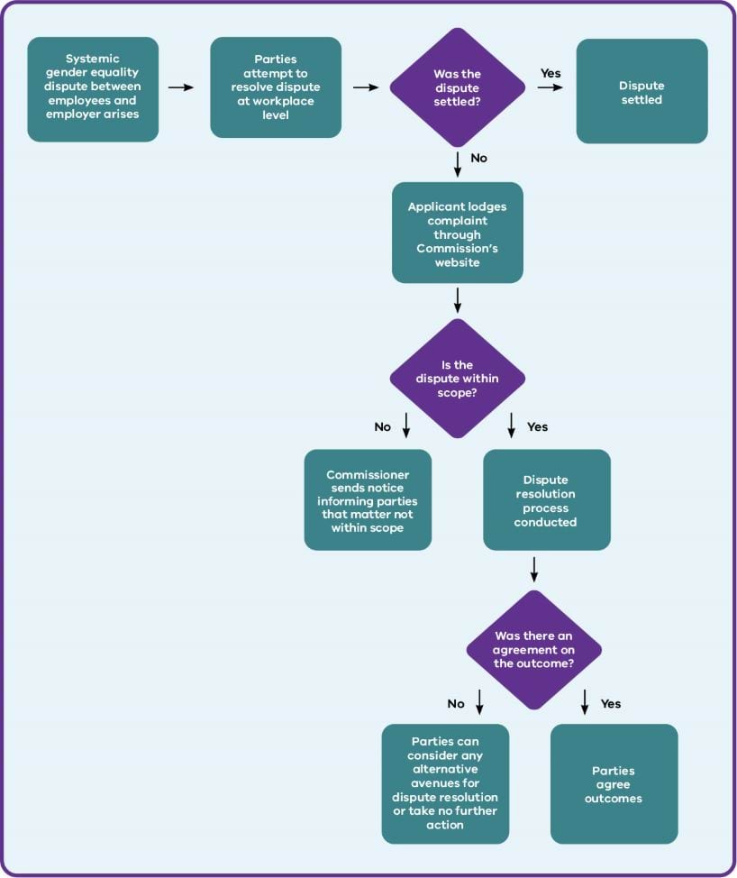
Complex image
The complex image component is used to present complicated graphical information like charts and graphs. Accessibility standards require these kinds of images to include a text alternative. You can also provide downloadable data for graphs.
Read our guide to learn how to add complex images(opens in a new window).
Timelines
The timeline component is used to arrange short 'blocks' of information in a linear chronological format.
Read our guide to learn how to add timelines.
Timeline title (optional in component; functions as H2)
Entry 1 title
Summary – this is the entry description.

Entry 2 title
Text - dates can also be entered here instead of the from/to field
Summary – this is the entry description.

Entry 3 title
10,000BC to next Wednesday
Summary – this is the entry description.
Data
We have a few components for displaying data, including
- Data table
- Data driven component
- Statistics grid
Data table
Unlike simple tables, which you build in the basic text component and which are best suited for tables containing text, the data table component is responsive - that means it automatically stacks your table by column or row on smaller screens, such as mobile phones.
Read our guide to learn how to add data tables(opens in a new window).
| Heading of column 1 | Heading of column 2 | Heading of column 3 | Heading of column 4 |
|---|---|---|---|
Heading of column 1 Data Lorem ipsum dolor sit amet, consectetur adipiscing elit. | Heading of column 2 Data Quisque sed dolor auctor arcu venenatis suscipit non dignissim velit. | Heading of column 3 Data Cras facilisis lorem diam, quis venenatis tortor elementum vel. | Heading of column 4 Data Cras ornare rhoncus dolor ac sollicitudin. |
Heading of column 1 Data row 2 | Heading of column 2 Data row 2 | Heading of column 3 Data row 2 | Heading of column 4 Data row 2 |
Heading of column 1 1,000,000 | Heading of column 2 2,000,000 | Heading of column 3 3,000,000 | Heading of column 4 4,000,001 |
Statistics grid
Below is an example of the statistics grid component.
- This is the statistic heading
- This is the statistic body.
- 70
- Apples
- 150
- Oranges
- 10
- Pears
Form
For more information on how to create or request forms, read the Process for new content.vic.gov.au webforms(opens in a new window) page on SDP.
Drupal form title
More resources
Sample of all SDP components
This example page shows all of the components that can be used with the landing page template.
Sample page: Basic text component formatting options
This page shows examples of the formatting options available using the basic text component.
Updated
